Policy Significance Statement
The COVID-19 pandemic impacted most of the World from the end of 2019, driven by human mobility and interactions. With different levels of impact, governments have applied restriction measures on the population. Thus, the ability to measure real-life aggregated anonymized population movement patterns would make it possible to gauge the effectiveness of those measures and instruct the decision of possible corrections. Vodafone supported local authorities in Italy by providing a tool for monitoring of such patterns at municipality level on a daily basis, making use of state of the art machine learning techniques applied to its mobile network data.
1. Introduction
The COVID-19 pandemic in Italy started its spread in February 2020, with first cases in northern Italy, in the regions of Lombardy and Veneto. Eleven municipalities in northern Italy were identified as the centers of the two main Italian clusters and placed under quarantine. Driven by people movement, after a few days, the virus had spread all over Italy. With the aim to reduce such spread, the government initially expanded the quarantine to the whole of Lombardy, and 14 other northern provinces, and on the following day to all of Italy, placing more than 60 million people in lockdown. Different actions were taken by the authorities in such period, for example, closing schools or closing businesses, with the aim to influence mobility and thus the opportunities for virus spreading. Thus, it became clear the need to understand how the mobility between municipalities and regions evolved, and how mobility within each municipality changed. Different datasets have been used to monitor in different ways, and at different granularity levels such movements. Initial work was conducted using data from Cuebiq (2020). Google also later released province level data (Google, 2020). Such data has limitations related to the samples of users considered to perform such statistics. In this paper, we describe the work conducted using Mobile phone network data from Vodafone. Vodafone has a market share of over 20% which allows to have a very high penetration of the population, quite homogeneous across genders and age groups. This makes such data a promising candidate to derive generalized statistics on citizens mobility. The Big Data and AI team at Vodafone developed an analytical solution to extract several mobility insights from the analysis of Vodafone Subscriber Identity Module (SIM) network data, and made such insights accessible to the Italian authorities as part of a philanthropic collaboration. Continuous iterations with the authorities allowed as well to evolve such solution to best suit the authorities’ needs and provide actionable insights. Vodafone also is participating in the Big Data and AI taskforce established by the Italian Ministry for Technological Innovation and Digitization for the COVID-19 Emergency. Finally, Vodafone is also sharing the mobility insights with the European Commission (2020) and the International Monetary Fund (2020).
2. Scenario
The telecommunications industry has been contributing to social good initiatives through the use of location analytics across different countries for a number of years (GSMA, 2020).
At the onset of the epidemic in Italy, toward the end of February 2020, we saw the value location-based insights could provide in understanding, modeling, and predicting contagion. We set out to build a first mapping of known outbursts in the Italian territory, as well as the traces of connections between them and international traveling events in an attempt to map the first contagion paths. The intention was initially that of helping predict which areas had the highest chances of becoming high risk of contagion (red) zones so action could be taken to prevent the spread to the whole country. After being made available through the corresponding institutional channels, the authorities were made aware of such capabilities. Because there was still no general knowledge about such techniques in many of the public institutions and organizations, it would not be until a few weeks later that the authorities were ready to be informed and discuss the use of the derived insights. Because by that time the virus had spread across much of northern Italy, the attention of the authorities shifted from understanding and predicting to monitoring social distancing and lockdown measures that were being enforced as a means to stop the spread. The ability to measure real-life aggregated anonymized population movement patterns would make it possible to gauge the effectiveness of those measures and instruct the decision of possible corrections. From the beginning, it was clear that this was a pro bono contribution and one of the pillars of Vodafone’s five pillar plan to help counter the impact of COVID-19 (Vodafone, 2020b).
There was interest and personal engagement in the top levels of the organization as well as across functional areas. Both at a local and group level, parameters were defined to enable information transfer. Concepts like citizen privacy, anonymity, and data security were first in line to start collaborating and teams worked to ensure standards were met before any information transfer was started. It was the task of our external affairs office, both at local and group level to manage stakeholder relationships. The first usable map with the required Key Performance Indicator (KPIs) was made available for the Lombardia region and soon after the dashboard was made available to other regions. By that time, a self-service tool with required user identification and security standards were required. Both were met using our already existing Vodafone Analytics platform (Vodafone, 2020a), which up until then served to provide location-based services to businesses and had already solved and standardized some of the compliance requirements. Based on feedback and requests from the authorities, subsequent versions of the resulting dashboard were improved in terms of KPIs and usability, as well as the inclusion of a download capability for those authorities who wished to use the mapped KPIs as input for deeper and cross-dimensional analysis.
3. Approach
In this section, we describe the analytical solution that we developed. Mobile phone network data from Network probes was already used at aggregated and anonymized level to extract insights into people mobility, both for internal uses, and for third parties as part of the Vodafone Analytics solution (Vodafone, 2020a).
Such solution is based on the use of network probe data which allows collecting information on which cellphone tower a particular SIM is connected to at a specific point in time (Calabrese et al., Reference Calabrese, Ferrari and Blondel2014). The spatial resolution is then at the cellphone tower level, which usually covers an area with radius from a few hundred meters (in urban areas) to a few kilometers (in rural areas). The sampling over time depends on how often the mobile device connects to the network infrastructure, and on the network technology used. For instance, for 4G connections we can identify events a few hundred times during a day (Pinelli et al., Reference Pinelli, Lorenzo and Calabrese2015).
The process to extract mobility insights from the data is as follows:
• extraction of dwells and trips from the raw location data;
• creation of mobility insights (e.g., home cell);
• aggregation of mobility insights data at different granularity levels (e.g., municipality) and representation into a dashboard.
3.1. Extraction of dwells and trips
The first step of the analytical pipeline is the calculation of stay locations by aggregating network data at network towers level. A dwelling time algorithm to estimate stops in a specific area has been used on the probe data. The algorithm receives in input a series of parameters, one of these is the minimum time threshold to be spent in a certain location. As minimum temporal threshold we used 30 min and this corresponds to the minimum stop duration. This allows to filter out noise from the data and secondly to catch only significant events. Finally, we executed the dwelling time algorithm at two spatial granularities to catch different phenomena: at the cell tower level, that is, how long a user stays in the area covered by a single cell tower, to get insights about how citizens were respecting the lockdown restrictions; at the municipality level, that is, how long a user stays in the area obtained by the union of the areas covered by all the cell towers located in the same municipality, to generate daily trips and build Origin–Destination (OD) matrices used to measure mobility patterns across provinces and regions. The mobility estimates have been regularly validated making use of pedestrian counts and sold tickets at different venues and events. The second step is to enrich stay locations: we enriched each stop with gender and age information of the SIM owner, so that at aggregated level it is possible to drill-down the analysis to obtain more useful insights able to provide the right answers to authorities questions, for example, young people not respecting the restrictions.
Finally, all data privacy actions have been put in place: firstly, all events generated by SIMs without geolocalization approval/permission have been removed, and secondly, k-anonymity was applied, that is, movements with less than 15 trips between two towns have been removed from OD matrices. This part of the mobility analytical asset provides the answers to the first question: how the mobility between municipalities and regions evolved over time.
3.2. Creation of mobility insights
The output of the previously described pipeline, such as knowing stop location of each single user, allows the creation of a series of mobility indexes that can be leveraged to understand what could be done in order to slow down the spreading of the virus.
3.2.1. Time away from home
This is a SIM-based attribute, it is calculated for each SIM and then aggregated later in the delivery process. It is defined as the total time a SIM spends away from its home location. For the calculation of this index, we estimate the home location and we decided to use one of the classic approach in literature: Calabrese et al. (Reference Calabrese, Lorenzo, Liu and Ratti2011) defined home as “the location where is registered the most activity during the evening and early morning hours.” Clearly, given the size of an area covered by a cell tower, this is a lower bound to the actual time spent outside home.
3.2.2. Percentage of people away from home
This is an aggregated index. This index aims to spot the proportion of people having at least one stay location different from their home location, over the total estimated population of the chosen aggregation level. As for above, this represents a lower bound of the actual mobility. Therefore, we define an area of interest over which we calculate the measure, and we aggregate it at different levels: municipality, province, region, and state.
3.2.3. Radius of gyration
This is another SIM-based attribute. It is a classic measure in location analytics literature (Gonzalez et al., Reference Gonzalez, Hidalgo and Barabasi2008). This is defined as the radius of the sphere, centered in someone’s home location, such that the greatest part of someone movements are inside the sphere.
With the first index we try to understand how much time people spend time away from home; with the second we try to understand how many people move from their home location; and with the third one we want to understand how far they usually go from their home. All the described indexes are enriched with gender and age information. This set of indexes aggregated for all SIMs of a specific municipality provides the answers to the second question: how mobility within a municipality changed over time.
3.3. Aggregation and dashboard
Once mobility insights were created, they have been made available to external parties through a web application which allows an easy access to the data at the different granularity levels, as well as comparison with different days. The dashboard was updated daily, with a latency of around half a day. The dashboard is developed in tableau embedded on a web application. This allowed us to provide the access to the data and insights in an easy-to-use way. The web application handles everything concerning the login, the permission and the provisioning of the system. The tableau part, instead, allows the end user to navigate and explore the provided insights. In the rest of this section, we provide more details regarding the tableau section of the dashboard, showing how we made accessible the data to the public authorities.
The dashboard has two views, the first one contains the O/D matrices and the second one contains the mobility KPIs.
3.3.1. OD matrix
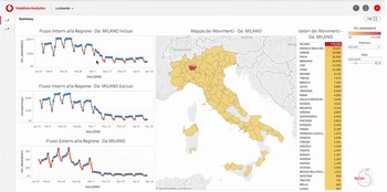
The OD matrix dashboard is represented in Figure 1. The page is divided into four columns, from the left to the right:

Figure 1. Maps representing the flows with origin in Milan toward the rest of Italy. It is evident from the time series of the dashboard the effects of the lockdown restrictions on the human mobility: there is a quick decrease of the flows IN and OUT at the begin of March 2020.
Time series
Time series of the ODs, from the top to the bottom:
• Internal regional flows including trips where start and end are from the same city.
• Internal regional flows excluding trips where start and end are from the same city.
• Incoming regional flows, all the trips having the end in a province/municipality of the region under analysis.
• External regional flows, all the trips starting from a province/municipality of the region under analysis.
Maps
A heat map of Italy shows all the flows with the origin in a province/municipality in the selected region. Notice that the darker is the color, the higher is the flow.
Rank
A ranked list is presented that is the representation of the adjacent map. The provinces/municipalities with the highest number of trips with origin one of the province/municipality in the selected region are represented at top of the list.
Filters
The last column contains a series of filters that can be applied on the graphs and maps.
• Selection of the origin province.
• Filter on the initial date to begin the visualization of the data.
From the dashboard it is possible to observe the effects of the lockdown on human mobility. From the end of February, mainly in Lombardia, people reduced their movements due to local initial lockdown. This reduction of flow received is more evident at the beginning of March. The time series highlighted very well this phenomenon. This visualization allows the estimation of the amount of movements between municipalities and regions.
3.3.2. Mobility KPIs
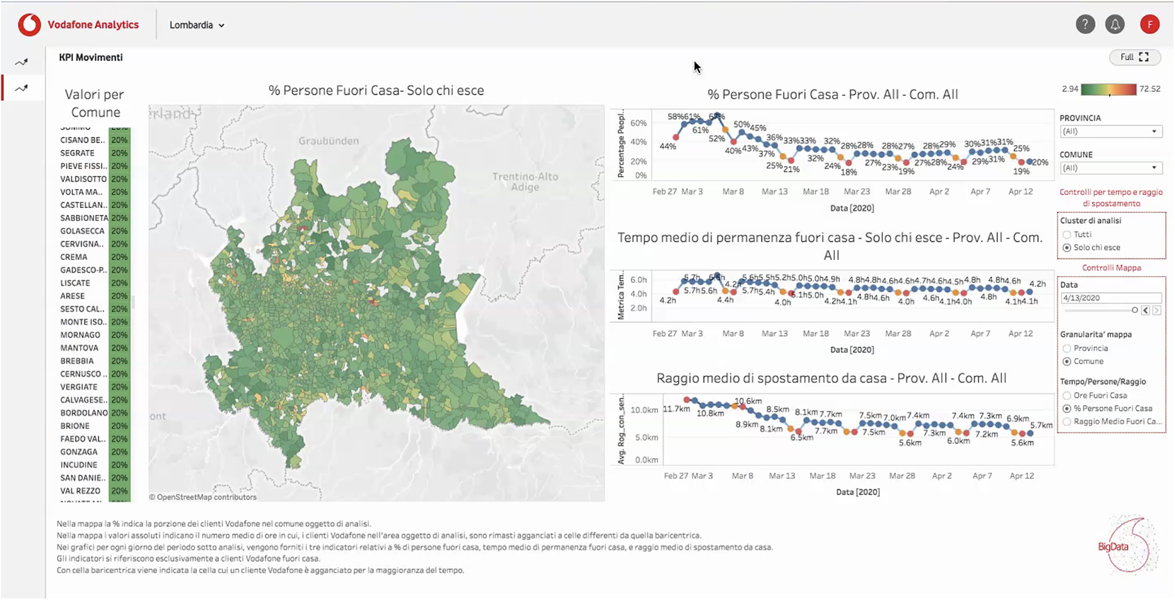
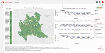
The second dashboard, see Figure 2, shows the aggregation of KPIs describing mobility insights. The mobility KPIs reported are: (a) the percentage of people out from home; (b) the average time spent out from home; and (c) and the average radius of gyration. The KPIs are visualized at province or municipality level. The view is divided into four columns. The first column from the left reports a rank of provinces/municipalities of the selected KPI. The second column geographically maps the selected KPIs at province/municipality level. The third column shows three time series of the above mentioned KPIs: percentage of people out from home, average time spent out from home, and average radius of gyration. The last column on the right, instead, provides to the end user:
• The command to select different province or municipality to visualize the KPIs for that specific geographical area.
• A radio button to select if the KPIs should include the whole population or only the one detected out from home.
• A series of controls related to the map: date sliding, spatial granularity radio button, and another radio button to select the KPI to be visualized on the map.

Figure 2. Visualization of the percentage people out from home. Also, in this case it is possible to see the reduction of the human mobility: spatially (radius of gyration) and temporally (time spent out from home).
It is possible to estimate the effects on human mobility of the lockdown through this dashboard, and it also gives the opportunity to identify which municipalities or provinces are better respecting the mobility-related virus containment measures. For instance, from the map the end user can identify municipalities with highest (in red) time spent out from home. This makes the dashboard actionable directly by the authorities so that they are able to send controls in specific and well identified areas. The insights provided by this dashboard are the answers to the second question: how mobility within a municipality changed.
4. Outcomes and Impacts
The definitive use case was that of providing the authorities with population movement patterns and KPIs at different levels of geographical aggregation. Almost each of the administrative regions of Italy had its own intraregion dashboard as well as a version of interregion map and data, which were updated daily. As stated earlier, the insights gained were used to monitor effectiveness of geographic restraint recommendations (e.g., closure of schools or specific types of commercial activities) and measures and correct deviations. While at a global level, Vodafone was vocal about the engagements with the different authorities in different countries or the collaborations with pan-European and international institutions like the EU, at a local level the communication was more reactive. Some of the authors engaged with a number of official institutions which started carrying out research into epidemiological topics in partnership with local researchers and other Communication Service Provider (CSPs). In general terms, the local media took these initiatives very positively as shown by numerous press releases and broadcasts documenting and explaining the benefits of location insights provided by telecommunications companies for controlling the COVID-19 epidemic (Reuters, 2020). The mobility insights generated by this work have been used to estimate the social and economic impact of mobility restrictions. For instance, the IMF performed a study to highlight the differentiated impact of lockdown measures on different age groups and genders (International Monetary Fund, 2020).
5. Lessons Learned
Getting a private enterprise and a local government to share data is not a simple task. A point might be made for and when to treat business data as open data. The public’s main concern has been privacy throughout so the organization had to go out of its way to explain how all processes were privacy compliant and European and Vodafone Group standards were met. Our experience shows that developments made to improve the company’s internal business, if properly industrialized, may be of great value to social applications and that, at least in the telecommunications world, there is a clear sense of responsibility matched to a high degree of development of location algorithms using network data. It is nevertheless also true that these organizations are more ready now than before to make their contributions to society, as blockers are cleared and the potential of data is collectively realized. At the same time, we have experienced different level of readiness of the local authorities in leveraging such data-driven assets. A higher degree of research and integration across official organizations may certainly help in that respect.
Data Availability Statement
Unfortunately, the key resources (i.e., the granular metadata produced by Vodafone network) necessary to replicate the findings are not publicly accessible for legal reasons (i.e., both GDPR and Italian Privacy Law prohibit sharing of such data).
Author Contributions
Conceptualization, F.C., E.C., V.F., G.M., F.P., D.R.; Methodology, F.C., E.C., V.F., G.M., F.P., D.R.; Formal analysis, F.C., E.C., V.F., G.M., F.P., D.R.; Data curation, F.C., E.C., V.F., G.M., F.P., D.R.; Writing—original draft, F.C., E.C., V.F., G.M., F.P., D.R.; Writing—review and editing, F.C., E.C., V.F., G.M., F.P., D.R.; Supervision, F.C., E.C., V.F., G.M., F.P., D.R.
Competing Interests
All the authors are Vodafone Italy employees.
Funding Statement
This work received no specific grant from any funding agency, commercial, or not-for-profit sectors.


Comments
No Comments have been published for this article.