“Every art-loving inhabitant of this Metropolis must wish that some sort of censorship could be established to which such outrages upon form and colour should be … submitted” (Daily Telegraph 1888, 5) (Figure 1). This writer was incensed by poster adverts, which, by the time he was writing, had become an ubiquitous scenery not only for Londoners but also across Britain, as across other industrialized states. The mass exhibition of images in the public sphere sparked a heated debate in Britain about aesthetic experience and calls for legal oversight, drawing a polyphony of voices. The meaning of these new visual environments hinged on questions about the boundaries between economic and aesthetic categories: advertising and art, capital and beauty, commerce and culture. Social groups and individuals involved in the debate—among them the organized billposting trade, the National Society for Checking the Abuses of Public Advertising (SCAPA), a civil society organization that led the aesthetic charge against outdoor advertising, state and local lawmakers, and a variety of citizens—mobilized a range of legal powers and concepts to determine where the boundaries lay. They used law to perform what sociologist Thomas Gieryn (Reference Gieryn1983, Reference Gieryn1999) has aptly termed boundary work and, in so doing, shaped ways of seeing advertising that are still resonant today. This article traces this history and its implications by telling the story of the hoarding—the outdoor advertising surface for posters (better known beyond Britain as billboard), which stood at the practical and symbolic center of developments.Footnote 1
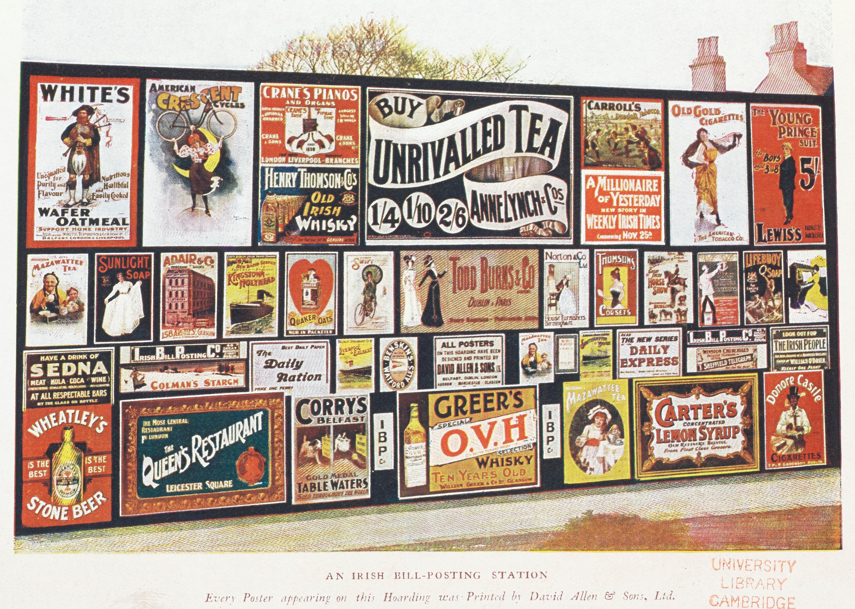
FIGURE 1. An Irish Bill-Posting Station. Credit: Clarence Moran, The Business of Advertising (London: Methuen & Company, 1905). Courtesy of Cambridge University Library.
The hoarding’s history began toward the mid-nineteenth century, when emergent billposting companies started to create new property rights in space by renting or buying display surfaces. This development, which assumed pace roughly alongside the rise of image-centered color posters, changed the meaning of advertising spaces. Historically, they were boundless and lawless, potentially coterminous with any and all surfaces on which bills could be physically posted. Now, however, advertising spaces were reimagined as a distinct value: fit for capture, divisible, tradable. The creation of new property rights might seem an unremarkable part of the rise of the mass market and the industry’s professionalization. However, in this instance, it was unusual due to its constitutive entanglement with aesthetics. As advertisers quickly realized, to redefine visible spaces as property regimes with stable conceptual and material boundaries required not only an economic but also an aesthetic justification and not only formal rights but also a resonant cultural construction that recognized space as visual matter and environment. Effectively, rights depended on aesthetics in the process of definition.Footnote 2
To explore this history, the first section of this article begins with the new legal regimes created in advertising spaces and the aesthetic criticism that they attracted. The following sections turn to the processes that shaped the hoarding’s aesthetic meaning, which relied on creative uses of law.Footnote 3 The advertising industry resorted to private law practices: it managed its properties as exhibitions inspired by the public museums movement and enlisted artists through contractual commissions and copyright purchases. These practices, examined in the second section, secured a competitive edge for billposting companies by concurrently monopolizing advertising spaces and transforming their aesthetic meaning. Specifically, the billposting trade argued that it was introducing a rational aesthetic in support of the progressive education of the nation. This move gained a hearing, yet also accentuated the sense of threat that advertising posed to art and the project of aesthetic progress. Therefore, criticism pitched in parallel with the hoarding’s success. Critics of advertising pursued a second legal route—of public laws—which gained momentum when the trade’s efforts reached a cultural pitch in the 1890s, known in art history as the Age of the Poster. Public laws, examined in the third section, focused on the hoarding’s location in the landscape and created a licensing regime. Building on earlier achievements of the trade itself, these laws privileged the hoarding over competing advertising forms and rendered it especially suitable for urban environments. In this way, laws actively shaped urbanity (and its countryside alternative) as well as advertising. However, public laws mainstreamed the hoarding by creating an aesthetic hierarchy based on legislated ideals of beauty, which also construed the hoarding as aesthetically compromised.
The overall process reveals a successful capture of space by advertisers, but one that came with a markdown in cultural capital. Laws assisted in mainstreaming the hoarding as obviously appropriate in modern outdoor life and yet obviously compromised in aesthetic terms. While aesthetically better than some other advertising forms, poster advertising was construed by local and state legislation, as well as by other legal mobilizations, as inferior to art and aesthetically unsatisfying. This way of seeing advertising remained influential long after the hoarding lost its primacy as a strictly material advertising medium.Footnote 4 The history of the hoarding thus demonstrates the significance of law as a cultural force that shaped visual commercial experience, showing that spatial encounters with advertising and their aesthetic interpretation have a long legal history.
The analysis relies on a wide range of primary sources that reveal the scope of the historical debate and the variety of participants and practices that shaped developments. The Billposter, a journal published from 1886 and held at the British Library archives, is a central source in this article since it was the official organ of the billposting trade from 1890. As we will see, the trade was organized on a national level and relied on the journal to report on legal battles vis-à-vis critics, municipal, and state authorities, and to debate and impose trade-wide legal policies. A Beautiful World, which was SCAPA’s journal, is another important source, available at the Cambridge University Library archives. The journal recorded SCAPA’s legal work vis-à-vis the billposting trade, local governments, parliament, and civil society. I also draw on Home Office records at the British National Archives, which reveal the negotiation of national and local regulatory policies on outdoor advertising. In addition, the analysis relies on journals dedicated to advertising such as the Poster and the Advertising World, publications by actors in the advertising industry, records of advertising agencies, the newspaper press, the work of public intellectuals, and parliamentary records.
In bringing public and private law together through these records, this article suggests that daily legalities such as contractual practices, soft recommendations to property holders, and the legal consciousness expressed by advertisers and citizens in encounters with hoardings and posters were consequential for the emergent legal-aesthetic regime of advertising. It thus veers away from a view of law in terms of state intervention in the market. Capital, state, and civil society were interwoven, with aesthetic evaluations negotiated by public and private actors. One implication concerns our understanding of the legislative reform that emerged after the turn of the twentieth century to regulate advertising. Contra a common view of this type of legislation as interventionist, this article shows that it was a legal-aesthetic organization of the hoarding that entered a dialogue with an existing aesthetic regime based in private and municipal legal power. Legislation drew on conceptual structures already in place rather than imposing a novel aesthetic regime on a spontaneous market eruption. Ultimately, it also placed fewer aesthetic pressures on advertisers than had earlier legal developments because, as we will see, it entrenched a previously unstable conceptual opposition between commerce and beauty. A related implication concerns the interpretation of law in the history of advertising. If law is not reduced to state interventionism, it is easier to appreciate its effects not only as a limiting force vis-à-vis advertising but also as a key to advertising’s legitimation.Footnote 5
Attention to law also offers more local methodological and conceptual contributions to the historiography of advertising. In particular, the analysis highlights the codependencies between individual works (posters) and the display strategies of collections. These questions of visual culture draw on two scholarly areas: art and design histories, where most work on poster aesthetics has been written, and histories of exhibitions, where the exhibition of adverts has been a neglected question. The history told here foregrounds the aesthetics of exhibition on the hoarding structure and within a broader understanding of national spaces, and demonstrates its practical and conceptual ties with the development of poster art. Ultimately, the history of outdoor advertising requires a joint perspective on these questions, which legal scholarship can bring to the fore.
Lastly, the legal perspective also implies a change in the periodization of poster history, which in most accounts begins in the late 1880s. Viewed through the legal lens proposed in this article, the systematic creation of new rights in advertising spaces, and the emergence of a specifically aesthetic understanding of the implications, a gradual process with roots in the 1840s and a clear presence from the 1870s, were the critical starting point for the modern history of poster aesthetics.
OUTDOOR ADVERTISING AND THE LEGAL TRANSFORMATION OF SPACE
Billposting versus Flyposting
In the second half of the nineteenth century, billposting companies began to mushroom, taking advantage of expansions in advertising spaces with the rapid building in cities. These organizations replaced the so-called billstickers, who were fated for rebranding as flyposters.Footnote 6 “Flyposters” were men, sometimes boys, often on casual hire, whose means of production were a stick, paste bucket, frequently containing self-made paste, and a brush. Their title implied that they pasted bills “on the fly,” on any physically accessible surface. Formally, posting on private properties was forbidden under the Metropolitan Police Act of 1839, and some other surfaces were also protected.Footnote 7 Yet little was off limits in practice: “[E]ven the doors of homes were not inviolable” (Presbrey Reference Presbrey1968 [1929], 91). The key feature of commercial billposting, which defined it in contrast to flyposting, was the legal formalization of posting sites. Companies acquired or rented the advertising space from the rights holder in the property. They would typically rent an entire “station,” construct the display structure, and manage it, all of which required capital investment.Footnote 8 By contrast, a flyposter was “a chap as posts his bills wherever he gits a chance.”Footnote 9
The flyposter was a familiar cultural figure. Charles Dickens (Reference Dickens1851, 601) immortalized him when a meeting with “[t]he King of the Bill-Stickers” appeared in Household Words. The account began with the impression of a plastered London and described the violent world of illegality of the billsticker who, the king said, “ought to know how to handle his fists a bit” (604). Advertisers capitalized on the mythology of rivalry, as the series of Bovril magic lantern adverts in Figure 2 demonstrates.
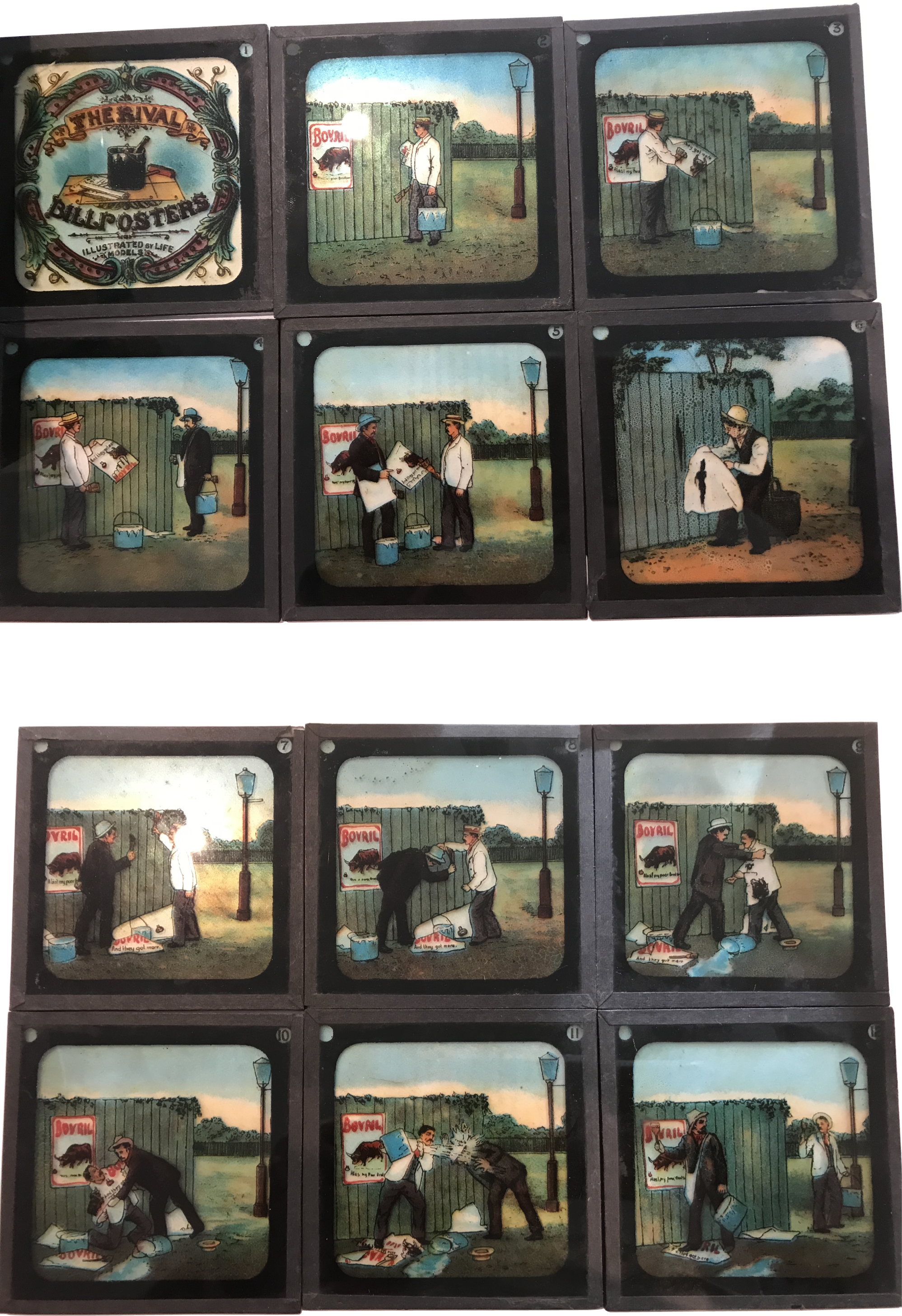
FIGURE 2. Bovril Magic Lantern Slides, circa 1900. Lesley Steinitz, private collection, by kind permission.
Until the era of capitalist billposting companies, locations for posting were neither bordered nor organized, even as some emerged as “stations” by mere concentration. Some private owners began to rent space to billstickers, but it awaited corporate economic interests for rent to become an enforced norm.Footnote 10 Commercial companies absorbed many flyposters. Their image as large-scale-sophisticated organizations, whose expensive apparatus replaced the bucket and brush, can be seen in the photo in Figure 3. Yet the transition was gradual. On the side of labor, casualization meant that many men worked not only for billposting companies but also took flyposting jobs. On the side of capital, at least until the late 1870s, some companies engaged in both billposting and flyposting (Purcell Reference Purcell1900, 207; Allen Reference Allen1957, ch. 6).Footnote 11 This was part of a broader picture of an advertising industry only just beginning to professionalize. Divisions of labor were murky on other fronts too. Throughout the late decades of the long nineteenth century, some billposting companies were also printers and offered poster production as well as posting. Services also had parallels with advertising agencies, with leading companies advising on campaign planning and offering campaign management (Nevett Reference Nevett1982, 91).
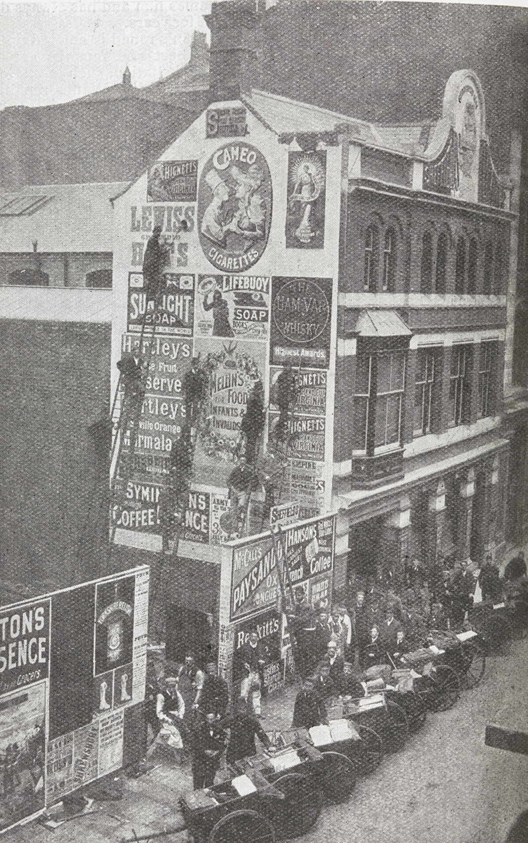
FIGURE 3. Sheffield’s Limited, a billposting firm. Progressive Advertising, May 2 1902, 50. These images circulated in the firm’s adverts from 1890s. © British Library Board LOU.LON 954, 1902.
The billposting trade was organized from the early 1860s and consolidated in the national United Billposters Association in 1890, with over six hundred member firms by 1900.Footnote 12 The association controlled competition by limiting entry, dividing areas of service, and unifying contractual terms. It also centralized the protection of the trade’s interests with effective lobbying and legal counseling, and managed an annual directory of “bona fide billposters” that consolidated its influence. The trade was the active power and public voice for outdoor advertising. It enjoyed diverse cooperation and support that exceeded its formal organization due to interests in income from billposting.Footnote 13
The same years saw the rise of lithographic, image-centered posters. Until the late nineteenth century, typographic posters with no images, or limited wood-carved ones in circumscribed vignettes surrounded by profuse text, were standard; as late as the mid-1870s, text still dominated.Footnote 14 Improvements in lithographic techniques and high-speed commercial printing enabled large colorful posters, in which images dominated and text was minimal and integrated with image. Those became more dominant even as text-centered posters continued to appear.Footnote 15
In the visual and legal landscape in which billposting companies intervened, unauthorized posting was standard. Cyril Sheldon (Reference Sheldon1937, 2) claimed that his billposting company inaugurated the system of rent of advertising spaces. The story had it that the wife of Edward Sheldon, who established the business, proposed rent in the 1860s after her husband got involved in a dangerous fight in Leeds over a site to which neither side had exclusive rights. As James Greenhalgh (Reference Greenhalgh2021, ch. 1) observes, Sheldon claimed too much, for rent and ownership of stations were in fact familiar from at least the 1840s, and assumed pace gradually, with growing trade organization.
Over the next decades, billposting companies created the hoarding by turning their new rights into mundane experience. Contemporaries had to learn to see publicly shared elements in their environments as untouchable and posting as a violation. This was a late reminder that private property depended on nonintuitive process of acculturation. One judge observed: “Of course, the origin of all posting, I understand, was fly-posting. That there was any valuable property and the right to post bills never occurred to people originally … but with civilisation, billposting became a valuable property, and we find companies dealing with it by having special stations.”Footnote 16 Lawyers saw that a new legal environment developed with the “increase in recent years of advertisement hoardings as a distinct form of ‘lettable interest’” (Redman Reference Redman1909, 56).
To turn its rights into a lived reality, the trade took multiple steps. It established lists of recognized billposters and brought them to the knowledge of advertisers, who increasingly refused to deal with unrecognized ones. It educated billposting companies on the law, explaining how to enforce and protect their rights. It asked members to approach vestry clerks and encourage them to end flyposting, and where private owners allowed posting on their premises, to calculate the rates and impose them so that private interests would align with trade interests (Billposter 1890a, 274; 1900b, 48; Sheldon Reference Sheldon1937, chs. 5, 7). Companies protected their rights in courts and encouraged private owners to do the same, so that both flyposters and those who advertised with them internalized the new order. Both civil and criminal cases served this goal. Civil cases relied on contracts and torts and sought both damages and injunctions. They included, for example, suits for breach of rent contracts, quasi-contractual demands to pay fees for posting on walls, suits for damage to property—both hoardings and bills, and for trespass on property—and injunctions to prevent access to property. Criminal cases involved prosecutions of flyposters for illegal posting that led to fines and imprisonment. Late in the century, courts saw that the order was still in the making and treated cases as exemplary.Footnote 17 The process was fraught. Among contested questions were such issues as the forms of contract that allowed a billposting company to sue without having the landowner or tenant join the proceeding, or the conceptual basis of damages to hoardings: was it only actual bills that were ruined or an abstract economic value? The rent system emerged through the scrutiny of such questions, to the point that it became the grounds of argument against flyposting: billposters asserted that flyposting was unfair competition because legitimate businesses “had to pay large rents.”Footnote 18
In addition to rights in stations, rights in bills were established and delegitimized pasting-over practices even where a space was not under a rent contract (for example, in the case Guildford v. Smith in 1892).Footnote 19 Cases of malicious damage to property, in which bills were damaged by competitors, coalesced with two other practices, which were also ideologically contradictory. On the one hand, there was damage by angry protesters who disliked particular posters, shabby appearance, or outdoor advertising per se, and this was joined by petty, usually youthful, violence of boys who tore, threw stones, or adorned posters with their own additions. On the other hand, there were poster collectors and their helpers in the age of the poster craze, which is discussed more fully below. The billposting trade pursued all attacks on its bills in courts and often summoned young boys on principle; the educating effect was uniform, disparate motivations notwithstanding. Companies published their lawsuits for maximum effect. Their success was evident in a circulating joke about a hunter reluctant to shoot a charging elephant because the animal was covered with adverts and the fine could be high (Advertisers’ Review 1900b, 5).
The cultural gap between flyposting and billposting was repeatedly iterated. The industry described flyposting as premodern: “[A] relic of an obsolete period when the first comer had the prior claim to a vacant space. … The bitterest animosities which still exist … between rival billposters are the legacy of the old billposting Vendettas, when every knight of the brush felt it to be a point of honour to cover up … the bills his rival had posted” (Billposter 1893b, 61). In Longman v. Pascall, litigated in the high court in 1892, a plaintiff claimed damages for slander, which consisted in a statement that he “had only six stations, the rest were simply flyposting stations.” Longman argued that he was injured in his credit and reputation.Footnote 20
Yet flyposting was not just small economies and class difference and was not in fact a historical relic to be denigrated or occasionally romanticized. In 1900 some three hundred “pirate bill-stickers” operated in London alone, according to one estimate, and cities were the center of capitalist firms’ efforts to drive them out. Into the twentieth century, flyposters were still surprised to discover that circumstances were changing (Billposter 1902, 79). The endurance of flyposting was tied to its notable cultural contexts. One was the traveling theatres and circuses, which partook in a transitory moment of modernity and were a diehard phenomenon.Footnote 21 Another notable context was political posters that peaked near elections. Flyposting belonged in the struggle for control of public space as a feature of electoral culture (Thompson Reference Thompson2007, 203). Thus, stories of night adventures not only continued but also took on a new cast: billposting companies engaged ex-detectives to watch over hoardings and spun new and exciting mythologies. Disguised “trackers” risked their safety amid the weapons of brushes and pots: “I have been covered with paste before now, and had bills posted over me while rolling over and over in the gutter among overturned paste-pots and scattered bills” (Billposter 1902, 79). Reliable numbers and their economic significance cannot be verified, but flyposting was enough of a threat for billposting companies to invest in legal threats and suits that would drive it out of existence.
However, the efforts of capitalist firms were in trouble almost as soon as they began in earnest, as the visual landscapes they created met with a vociferous aesthetic criticism.
Aesthetic Criticism
Many contemporaries viewed the spread of industrialism and the democratization of consumption as the interrelated drivers of aesthetic degeneration that required urgent responses. As John Steegman (Reference Steegman1987) has argued, the nineteenth century was afflicted with doubts about its taste and set out to reform it in ways that never occurred to its predecessors. Efforts to improve tastes enjoyed a wide cultural purchase, from private homes, through indoor spaces of display—museums, galleries, exhibitions, and shops—to outdoor life. Concerns with artisan versus mechanical work and with the lowering of standards under popular pressure were widespread. These themes informed well-known movements like the Arts and Crafts Movement from the 1880s, the Town Planning Movement from the 1890s, artist societies, and preservation societies (see, for example, Nead Reference Nead2000; Cohen Reference Cohen2006; Maltz Reference Maltz2006; Kriegel Reference Kriegel2007; Waterfield Reference Waterfield2015). Yet the aesthetic criticism of adverts had a particular bite: the problem was an absence of art in a genre that claimed to circulate images in the public sphere as never before and “deliberately violate[d] the wayfarer’s mind” (Haxton 1902, 96).
Aesthetic criticism assumed dominance in the last three decades of the century, and overshadowed earlier criticisms of outdoor advertising, which, as Greenhalgh (Reference Greenhalgh2021, ch. 1) observes, treated it physically in terms of nuisance and obstruction, within a broader preoccupation with managing crowded city streets. In the closing decades of the century, discussions of advertising turned increasingly to aesthetics. Eyesores, disfigurement, desecration, defacement, vulgarization, horrors, hideousness, and ugliness became widespread currencies, reaching a pitch in the 1890s. In 1890, an Art Congress announced that advertising was a national disgrace (Billposter 1890e, 295). William Morris wrote in 1893 that, although adverts disgusted him, he rejoiced at the “spectacle of the middle classes so annoyed and so helpless before the results of the idiotic tyranny which they themselves have created.”Footnote 22 The Billposter carefully collected criticisms, which were accepted by supporters no less than “enemies.” The journal The World, for example, published an article supportive of outdoor advertising, yet said: “[T]he whole billposting fraternity continues to display … a truly shocking indifference to schemes of colour” (reprinted in Billposter 1896b, 147).Footnote 23
Timothy Hyde (Reference Hyde2019) argues that judgments of ugliness should give us pause. Far from secluded questions of taste, they are instrumental in the invigoration of social processes. An affective response of disgust often came with these judgments, as Morris exemplified. Disgust was bound up with an entire public language that recommended aesthetic revulsion, as Zachary Samalin (Reference Samalin2021) shows.Footnote 24 And, indeed, aesthetic criticism became a civil organization. SCAPA was established in 1893; the architect and royal academician Alfred Waterhouse was president, the Irish barrister Richardson Evans its active secretary. SCAPA numbered over seven hundred members in 1894, an elite but politically diverse and gender-mixed group that enjoyed broad support (Readman Reference Readman2001). Its aims were “checking the abuse of the practice of spectacular advertising, and … protecting and promoting the picturesque simplicity of rural and river scenes, and the dignity and propriety of our towns” (Beautiful World 1893, Appendix A, 26). To these, it added in later years a general aesthetic goal of “asserting generally the importance, as a great public interest, of maintaining the elements of interest and beauty in out-of-door life” (Beautiful World 1903, 121).
Why were advertising aesthetics important? Commentators reflected diverse perspectives rather than any unified theory, but arguments that tied aesthetics with ethical education and ideals of national progress dominated.Footnote 25 Especially important was national morality, which was often discussed with a competitive eye to the advances of other countries (Evans Reference Evans1926, 136). As the critic and SCAPA member William Lecky (Reference Lecky1893, 467) argued, “[f]ew greater misfortunes can befall a people than the decay of their sense of beauty, and it is impossible to vulgarise national taste without, at the same time, lowering national character.” Speaking in a 1901 SCAPA meeting, the jurist and former Liberal member of parliament James Bryce described the hoardings as a decline to barbarism: “Those crude colours which are employed are the revival of the vivid tints with which our ancestors dyed their skins, and produced very much the same satisfaction” (Beautiful World 1903, 84, 88). Critics complained that it was inconsistent to invest in museums, galleries, and art education but undermine their values by adverts (Severn 1889, 127; Billposter 1890a; St. James’ Gazette 1891).Footnote 26 The religious undertones of quests for moral progress were channeled into an educational civilizing project bent on rationalizing tastes.
Criticisms might seem close to what Tony Bennett (Reference Bennett1995, ch. 1) describes as governance through culture, but the cause was actually more diffuse. The complex relationship of aesthetic critics to class clarify the point. On the one hand, classed discourses were prominent, as critics treated the lower classes as agents of change who would learn to reject ugly adverts, as well as beneficiaries of any aesthetic improvement. SCAPA wanted to teach the ideals of sobriety, neatness, and order to “the common folk” and “the multitude” (Beautiful World 1893, 8, 9; 1894b, 114–15). As Peter Gurney (Reference Gurney2017, 81) observes, SCAPA’s leaders were isolated from radical organizations. However, on the other hand, aesthetic criticism fed on a convergence of class interests. As SCAPA speakers argued, “the tastes which we seek to develop and protect exist in all classes” and brought to the aid socialist criticisms of “ugly placards” (Beautiful World 1903, 130–31, referring to the Co-operator’s Year Book of 1901). It was at least true that the cleansing project that wanted to save the poor from being “condemned to vulgarity” in the streets resonated not only with aesthetic elitists but also with socialist critics of capitalist advertising (Spielmann Reference Spielmann1881).Footnote 27 Charges against advertising aesthetics were therefore irreducible to a high-brow governance project.Footnote 28
Beyond national morality, aesthetic criticism received additional rationales as critics tried to enlist broad support. Particularly important were economic arguments against advertising display, which included strict economic interests such as the touristic income from beautiful sceneries, and more complex concepts such as private property in one’s sight that competed with the economic assets of billposting companies (for example, Beautiful World 1903, 25–28, 124; 1909, 31, 55).Footnote 29
The aesthetic charge was one facet of a broader-ranging set of concerns about advertising in this period, which arguably gave impetus to aesthetic critics. The same decades saw heated debates about the threat that press advertisers posed to the information value of news (Rosenberg Reference Rosenberg2019). They also saw a lively controversy about the compromise of scientific truth under the pressure of so-called quack advertising of proprietary medicines and foods (Rosenberg Reference Rosenberg2021; forthcoming). This latter debate was directly relevant for posters because medicines were a salient category on hoardings.Footnote 30 A third important debate concerned the indecency of poster images, in which theater posters—another important content category—dominated. Religiously-inflected fears about advertising and morality also informed debates about gambling, in which posters were less significant but did occasionally feature. Meanwhile, political advertising was central to political conflict in the early twentieth century and was another source of tension (Thompson Reference Thompson2007). Law had a role to play in boundary work in other debates too, and, here too, a dual process of legitimation and inferiorization of advertising could be found, although the conceptual focus was differently structured because each case involved a different set of actors, interests, cultural values at the center of contestation, and legal routes (Rosenberg Reference Rosenberg2019, Reference Rosenberg2021, forthcoming). In the case of outdoor advertising, aesthetic criticism developed its own language and conceptual apparatus, which were principled and focused on media and location rather than on advertised content, even if individual complaints occasionally referred to specific contents. However, it gained force in a wider critical atmosphere.
With aesthetic criticism came calls for legislative oversight. In his book Democracy and Liberty, Lecky (Reference Lecky1896, 139) called on the legislature to free the public from “gigantic advertisements … [which] destroy the beauty both of town and country.” Parliamentary work was high on SCAPA’s agenda. Yet legal responses to aesthetic criticism began before legislation and beyond public authorities. Advertisers realized that the capture of space through the rent system depended on an attendant aesthetic definition and were committed to its elaboration. The following section examines their efforts.
PRIVATE LAW AND ADVERTISING AESTHETICS
Rent: Display Aesthetics
The trade argued that new rent practices were really an assumption of responsibility over aesthetic display in order to overcome the travesties of flyposting. On a common argument, flyposters’ indifference to aesthetic effects entailed a loss of meaning. One reader claimed to have read this advertising collage: “Pigs fattened in six weeks on the Englishman, edited by Dr. Kennedy. Price 2d weekly, and kills fleas, beetles, insects and all kinds of vermin. Perry Davis’ pain killer cures smoky chimneys, and notice to mothers, feed your infants on Bond’s marking Ink, 6d. per bottle” (Billposter 1890b, 149). Visual examples were also familiar. The old advertising station in Figure 4 was a drawing in an advertising professional’s publication, which emphasized messy display and overlap as a problem of flyposting. Probably the most famous representation of this theme is A London Street Scene by John Orlando Parry, which was created in 1835 (Figure 5). The painting has been read as a commentary on advertising’s power to overtake cities. What needs emphasis is that this display style represented the “chaotic result of the fly-posting era,” as a Times retrospective put it (Times 1961). As Sadiah Qureshi (Reference Qureshi2011, 51–52) observes, Parry’s painting captured how reading was made difficult by the overlaying of bills, their boundaries hard to discern.
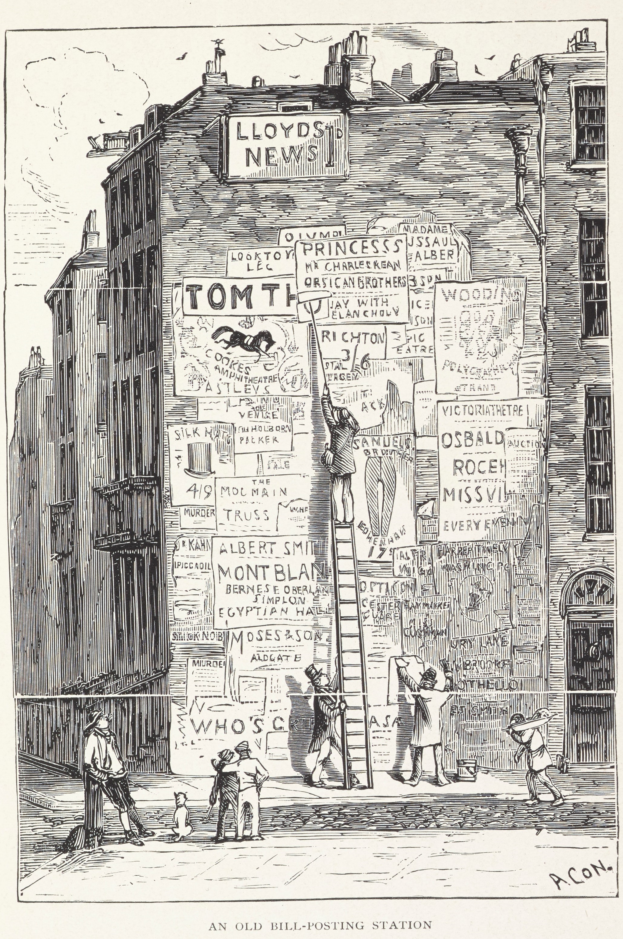
FIGURE 4. An old bill-posting station. Clarence Moran, The Business of Advertising (London: Methuen & Company, 1905). Courtesy of Cambridge University Library.
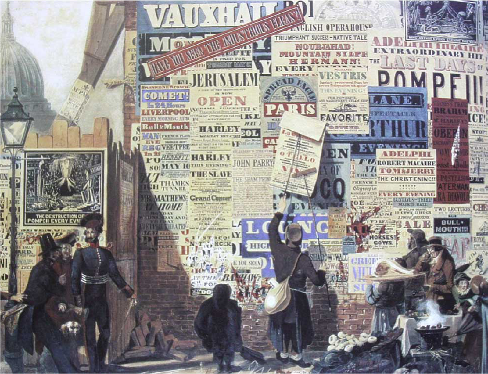
FIGURE 5. A London Street Scene. John Orlando Parry, 1835. Wikimedia Commons.
Already in 1863, William Smith, manager of the New Adelphi theater, advised a shift to orderly presentation with aesthetic commitments: “[H]ave painted boards with neat mouldings and in bright colour; get them of as near one size as possible. This will give them an air of respectability” (Smith Reference Smith1863, 119). Drawings accompanied the advice (Figure 6). The new rent system was hailed for achieving the rational order of William Smith’s dreams (Sheldon Reference Sheldon1937, chs. 5, 7). Billposting companies advocated a rational aesthetic as the raison d’être of their hoardings, dubbed galleries of the people, and so wedded property power with aesthetic responsibility. Their advocacy drew on the goals of public museums as non-exclusionary spaces with a national civilizing mission.
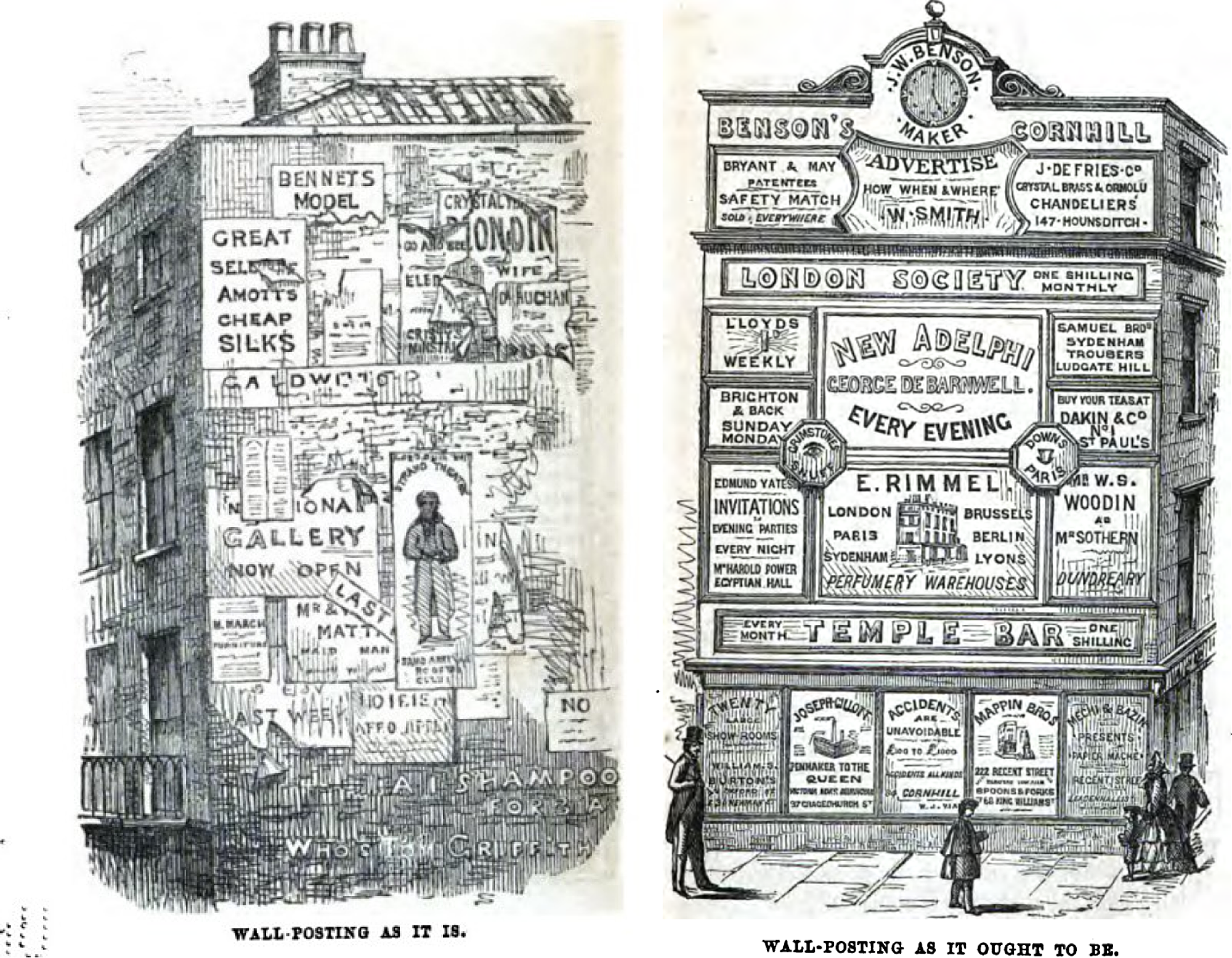
FIGURE 6. Wall-posting as it is and as it should be. Drawings by R.T. Powney. William Smith, Advertise: How? When? Where? (London: Routledge, Warne and Routledge, 1863).
A rational aesthetic was streamlined into the contractual infrastructure of billposting on a trade-wide basis. The trade wanted hoardings “smartened up, kept clean, well ordered, all out of date posters covered immediately.” Bordering and symmetry became standard requirements of professional billposting (Billposter 1896a, 124–25; 1896d, 95; Sheldon Reference Sheldon1937, 23–24). “Good repair” became a standard contract term in 1905 (Sheldon Reference Sheldon1937, 23–24). These aesthetic aspirations resonated with the nineteenth-century museum as a rational alternative to the disorder of competing exhibitionary institutions and historical cabinets of curiosities. The narrative was a similar one of chaos to order.Footnote 31 Of course, the hoarding could never embody all of the cultural assumptions associated with museums. Billposting companies did not control content, where broadly political questions like representativeness, intellectual synthesis, social power, and history began to inform museum exhibitions, nor could they choose creators, specific combinations, or the scope and length of exhibition. As we will see, companies also had no interest in sacrificing paying contracts for overarching aesthetic agendas.Footnote 32
However, similar challenges were also true for mushrooming galleries and museums, most of which were built between 1870 and 1914.Footnote 33 Questions of arrangement, picture crowding, and background colors, all of which were taken up by the billposting trade, were regularly aired and criticized as institutions like the National Gallery fell short of ideals of clean hangings, proportion, and order (Waterfield Reference Waterfield2015, ch. 7). Within the nascent terms of Victorian art exhibitions, advocacy for the hoarding was not as remote from the art museum as it can seem today. The trade’s arguments that its displays served the advancement of knowledge, and that it was alert to its civic mission, therefore made sense. With the materials under its hands, within a new legal structure, there was room for discretion absent from flyposting, and the trade claimed a progressive change.
As with legal rights to rent, so with display on rented hoardings—the lessons needed hammering in. In its second issue, the Billposter announced that it was engaging an inspector to report on the condition of stations and encourage trade members to “improve their style” (Billposter 1886a, 11). Inspectors were also employed by billposting companies and advertising agents to oversee the quality of pasting and the observance of clients’ instructions, and to guard against flyposters. These contractual concomitants served the same cleansing act (see, for example, Pearson’s Weekly 1902, 570). We thus see mundane contractual practices between billposters and end advertisers, and between an organized trade and its members, deployed to establish and defend an aesthetic meaning for advertising.
In 1897, the Billposter began a run of object lessons of “artistic billposting.” For example, it advised that the hoarding shown in Figure 7, although “neat and attractive,” could be improved by more bordering and less bills.
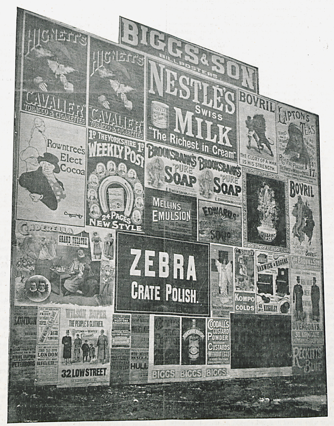
FIGURE 7. Keighley hoarding. Billposter, April 1897. © British Library Board LOU.LON 983, 1897.
The chastening of exhibition style became a major preoccupation. To take another example, Cyril Sheldon (Reference Sheldon1912, 5) contrasted the hoarding in Figure 8, viewed as irregular and uneven, with the one in Figure 9, showing standard sizes and achieving “really presentable appearances.” Bad aesthetics, he argued, were mistakes of small and inexperienced contractors, while professionals knew how to give effect to adverts. Figure 8 often strikes twenty-first century observers as more attractive. Sheldon’s preference highlights the historical emphases of the trade on straight lines, consistent filling of space, and symmetry, which informed the display in Figure 9 (the symmetrical treatment of the top right and bottom left is particularly salient). The same emphases applied in many art galleries.
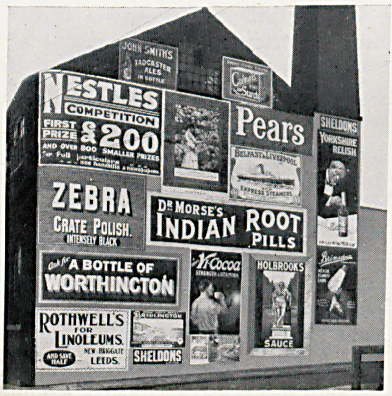
FIGURE 8. Placard, April 1912. © British Library Board LOU.LON 790, 1912.
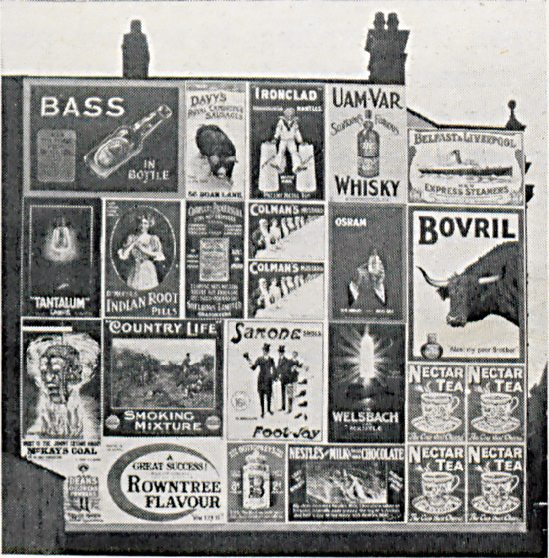
FIGURE 9. Placard, April 1912. © British Library Board LOU.LON 790, 1912.
Display efforts attracted approving commentary:
at Kensington a hoarding … had been treated as if it were a wall in an art gallery. First of all, a background has been prepared by covering the wooden hoarding with a dark brown paper, round which runs a scroll border. Then on this wall the coloured posters, which are mainly pictorial, have been affixed, with black spaces intervening and with due regard to the individual characteristics. The principle followed is indeed that which our more advanced artistic societies have adopted when hanging their works. As each painting is as far as need be isolated, so each poster stands alone, and the eyesore which is caused by jumbling and overdoing is avoided. (Pall Mall Gazette 1893, 1–2)Footnote 34
The artist Walter Crane reportedly praised billposting: “[T]he billposter does not do his hanging badly; quite as well, in fact, as the committee of the Academy” (Billposter 1905, 253). Clients also appreciated the new display style. C. Bliss, the director of Mellin’s Food, which was a prominent advertiser, explained that location, color relations between posters, preservation of posters from paste, and bordering within a square, were necessary to bring out the art of their valuable posters (Billposter 1897,152). As one advertising professional put it, ‘[t]he value of the thing itself, and the importance of the space and situation … are very closely entwined’ (Progressive Advertising 1906, 11). David Henkin (Reference Henkin1998, 70) notes that the collage of overlapping bills radically severed adverts from their author’s control and intentions. There was a greater sense of control in bounded bills, which coalesced with the new aesthetic. The News Agent and Booksellers Review (1900, 192) noted pedestrians’ and bus riders’ interest in hoardings and recommended similar reforms in shop windows.Footnote 35
In a lecture at the Bradford Club, a member noted additional strengths of the hoarding. Not only were notions of beauty conveyed to the masses, with proportions of good to bad pictures as in any gallery, but also “[s]moking was not prohibited, and one might point with stick or umbrella” (Billposter 1907a, 117–18). This comment reveals the challenges of sustaining boundaries for the hoarding while attracting audiences. As in other concerns that admitted an undifferentiated mass public, such as trains, shops, or museums, behavior had to be controlled. For outdoor adverts, the challenge was technically and conceptually complex because legal and material boundaries depended on an attendant aesthetic appreciation. As the trade’s efforts to protect bills from diverse political and social bents—admirers and opponents of posters, petty vandalists, entrepreneurs, and high-minded aristocrats—revealed, the problem was not restricted to lower-class habits. Public institutions often worried about what they perceived as an uninitiated mob, but the goal of advertisers was equally to secure respect from the initiated, who could be more threatening. The balance was delicate; gentlemanly stick-pointing was a conduct to be managed without destroying, for it could mean a coveted sympathy.
In 1911, William H. Lever announced the “Artistic Hoardings Competition” (Billposter 1911a, 207). Figure 10 shows the first-prize winner, exhibiting the aesthetic ideals of the trade.
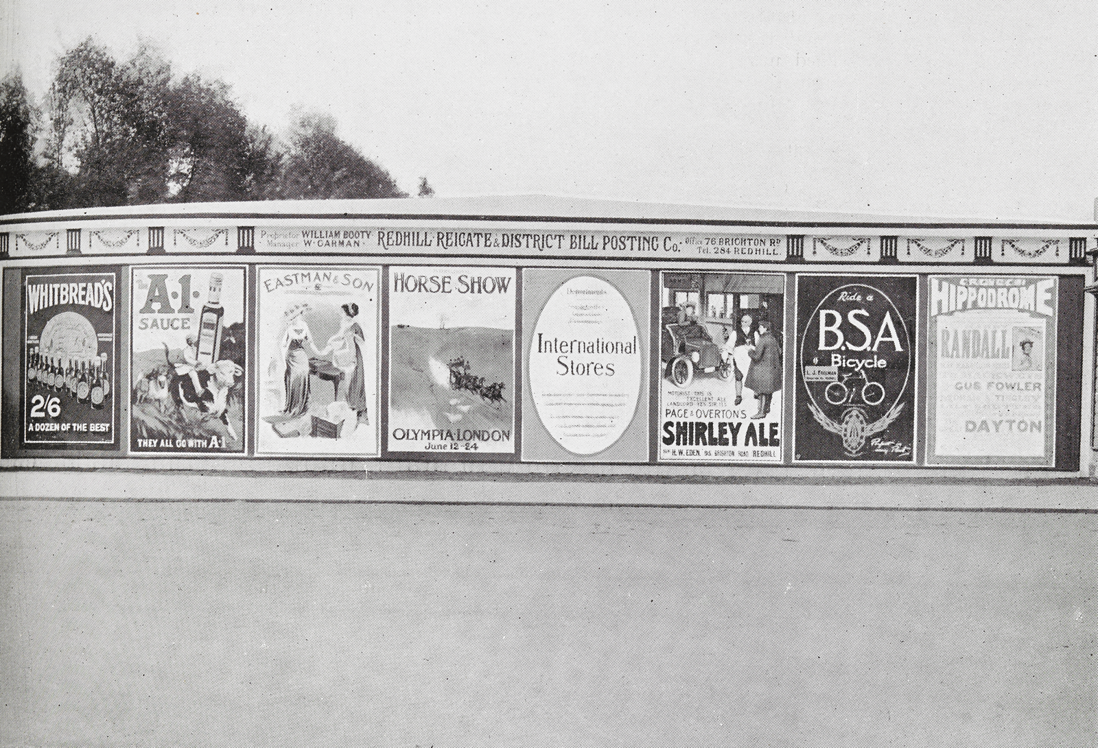
FIGURE 10. Redhill hoarding. Billposter, August 1911. © British Library Board LOU.LON 798 [1911].
As other photos clarify, these ideals were not usually attained. The new aesthetic was expensive. The aspirations of consistent sizes, bordering, and smaller numbers needed reconciling with profitability.Footnote 36 On any single hoarding, this practically meant, in the lingua franca of the trade, running as many contracts as possible at any given time. Ornamentation was minimal given space considerations, but it was nonetheless advocated as something of a watered-down ideal of museum elegance. Materials too had to be cost effective. Paper rather than wood was both cheaper and easier to change (for these alternatives see Figure 11, top and bottom examples). The cheap appearance of these economic choices did not seem to raise anxieties. The trick was to economize on materials and get in a maximum number of bills, without violating minimal aesthetics. Economic success literally hung in the balance between too little and too much aesthetic commitment.
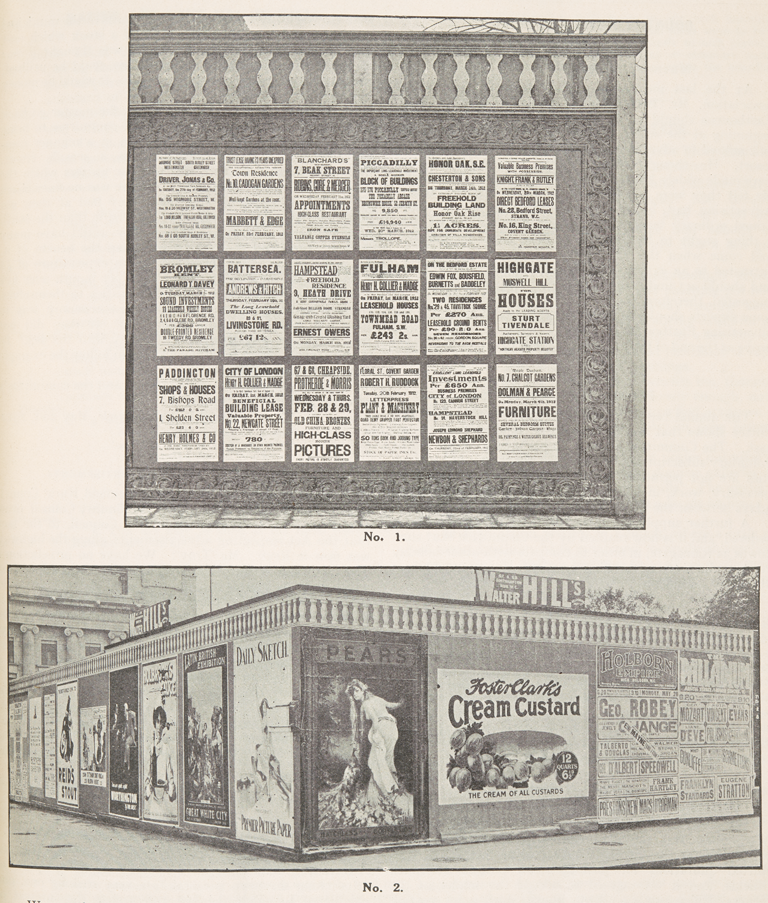
FIGURE 11. Billposter, June 1912. © British Library Board LOU.LON 790, 1912.
Despite compromises, and although to future advertisers the display aesthetics of these years would seem crude, billposting companies led a popular aesthetic change. The new aesthetic allowed them to create the hoarding as a bounded space. Its limits were understood in contrast to the emergent inaccessibility of spaces not contractually rendered as hoardings, on the one hand, and the limits of access to contractually rendered ones by anyone except rights holders, on the other hand. The legal consciousness of limits turned a rapid economic capture into its opposite: a clearing. The space also assumed internal coherence defined by the legal control of the entire surface, which translated into the aesthetic management of construction materials, ornamentation, and display. This creation wedded competitive goals with responsiveness to aesthetic criticism. Sheldon (Reference Sheldon1937, chs. 5, 7) summarized the trade’s historical outlook: critics complaining about vulgarity and disfigurement after the turn of the century really had in mind the situation of a generation ago and not the new orderly world.
Trade investments in the hoarding also transformed individual adverts. As I now turn to show, contractual commissions and copyright purchases were key to this transformation.
Contract and Copyright: Poster Aesthetics
“Artistic posters” were outdoor graphic posters understood in opposition to commercial ones, although both types were adverts. As Ruth Iskin (Reference Iskin2014, introduction) explains, they were characterized by sophisticated color, composition, and line, by the replacement of realism and melodrama with decorative sensibilities, and, in art history, have been associated with the modernist style that embraced flatness, abolished shading, and often brilliant colors and bold lines, under a variety of artistic influences (see also Barnicoat Reference Barnicoat2003). In popular discourse, artistic posters were often associated simply with the work of trained artists. The artistic poster has been the subject of extensive scholarship, yet this section changes perspective by placing it within the history of the hoarding. It briefly recalls developments and then highlights their symbolic function within the transformation of space, while shining further light on the tensions of an aesthetically imbued economic space.
Two events are widely considered to have inaugurated the introduction of art to posters in Britain. One is Frederick Walker’s poster The Woman in White, which was created in 1871 for the Olympic Theatre’s adaptation of Wilkie Collins’s novel (Figure 12).Footnote 37 The second is the 1886 use of a painting by John Everett Millais, Bubbles (originally titled A Child’s World), for an advert of Pear’s Soap (Figure 13).Footnote 38
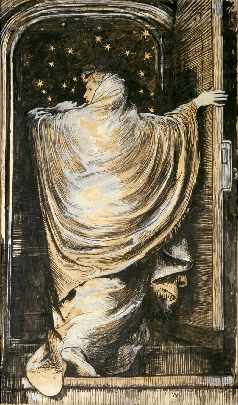
FIGURE 12. The Woman in White, Frederick Walker, 1871. © Tate Gallery, N02080. Creative Commons CC-BY-NC-ND 3.0 (Unported), https://www.tate.org.uk/art/artworks/walker-the-woman-in-white-n02080.
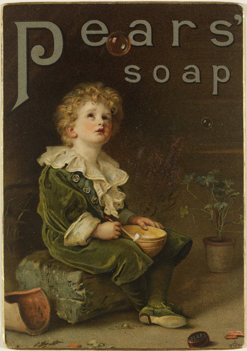
FIGURE 13. Bubbles, John Everett Millais, (artist), A. & F. Pears Limited (publisher), circa 1888 or 1889. © Victoria and Albert Museum, London, E.224-1942.
The two events were different from each other and, more interestingly given their status in advertising history, from what would become the widespread form of engaging artists in advertising in the next two decades—namely, contracts with printers who added artistic designs to their stocks (Hewitt Reference Hewitt2007).Footnote 39 Walker anticipated the practice of contractual commissions of artists that became widespread from the late 1880s, but The Woman in White was commissioned directly by Collins, an artist-to-artist engagement that set the case apart. With Millais, the artist did not anticipate advertising when he created the original. Bubbles was an oil painting, its copyright first bought by the London Illustrated News for reproduction in a Christmas supplement. Thomas J. Barratt, the managing partner of Pears, acquired it from the newspaper for 2,200 pounds and then asked Millais’s permission to add his firm’s name and a bar of soap to the image. A controversy endures about Millais’s response: was he helpless or satisfied? (for a discussion of both views, see Barratt Reference Barratt1899; Millais Reference Millais1899, ch. 18; see also Dempsey Reference Dempsey1978; Bingham Reference Bingham and Timmers1998). Contentiousness only served the campaign.Footnote 40 As Barratt himself said, the cultural focus on the original purchase missed the fact that most of the company’s efforts were directed to reproduction (Barratt Reference Barratt and Simonis1908). Bubbles was not the only case of adaptation of art works, but the practice remained marginal in posters.Footnote 41 At its best, it was a subversive move that countered what George Wallis, the first Keeper of Fine Art Collection at South Kensington Museum (later the Victoria & Albert), called the fetishistic worship of original works (Wallis Reference Wallis1888). But harnessing a work of this kind for advertising and running copies by the millions popularized a possibility that could not but summon a Benjaminian set of concerns about the status of art in capitalism (Benjamin Reference Benjamin and Underwood2008 [1935]). Complaints about the prostitution of art were forthcoming. We might view Barratt’s copyright purchase as a forced connection in an atmosphere in which artists risked shaming if they cooperated with advertisers.
The atmosphere was hard to overcome, despite encouragement. For example, the Magazine of Art, edited by the author and critic Marion Spielmann, wanted to see artists driving “hideousness” out of the streets. This was part of the artist Hubert Herkomer’s reformist agenda for advertising posters (Spielmann Reference Spielmann1881; see also Korda Reference Korda2012). Artists were uncomfortable, often refusing to sign designs and adopting pseudonyms for poster work (Billposter 1886b, 71; Daily Express 1905). As John Hewitt (Reference Hewitt2007) observes, poster designers trained in art maintained a distance from advertisers even as they worked for them—for example, by working in studios rather than the printing workshop and by creating speculative designs that were not explicitly tailored to particular products.
The Barratts of the world were not easily deterred. Barratt himself argued that he was spreading art and culture more than the Royal Academy and “endless galleries,” a claim repeatedly echoed in celebrations of Bubbles and of posters generally. These arguments attempted a radicalization of pubic museums’ access mission and often gained a hearing. An inspector of the Poor Law Schools could praise in 1899 the headmistress of the Dover Union Girls’ School for decorating school walls with “pictures used as advertisements” by “well known firms as Pears, Nestlé, etc.”Footnote 42 Success led to thefts, which in turn allowed poster effects to resonate widely with public cautionary notices and legal proceedings. At the Bolton Borough Police Court, two billposters were charged with stealing Bubbles pictures. One defendant fit it into a frame and hung it up. The assistant prosecutor, J. H. Hall, appeared on behalf of the advertising agents and described the pictures as beautiful. He asked the court not to be severe since the purpose was merely “to demonstrate that these valuable pictures cannot be removed with impunity.” Alderman Nicholson was resistant: “You cannot use the Court for your own purposes,” but he levied a fine (Billposter 1888b, 39). In the Hammersmith Police Court, another billposter was sent to prison for stealing two copies of Bubbles that he had resold. Pears’s advertising agents published the story (Billposter 1889b, 13).
By the mid-1890s, the industry was self-congratulatory amid an international poster movement (for example, Billposter 1896c, 181). Comments on the popularity of posters and on the collecting spree were widespread (Spielmann Reference Spielmann1895; see also Rickards Reference Rickards1971). The movement gained a place in art and design histories, a success due to the international character of works that created a cross-border artistic language. British designers quickly rejected the academic tradition in favor of French influences. The quality of creations as art was bolstered by a dedicated literature that sprang to study posters and periodical reports on new works on hoardings, exhibitions, galleries, design competitions, and collecting, which in turn encouraged a market in poster prints. These satellites of posters, however motivated, provided forms of instruction and intellectualization absent from hoardings as galleries; they functioned as symbolic compensation for shortfalls in museum-like aspirations. The trade embraced these trends, albeit selectively: in line with its sources of inspiration, it did not flag the modernist challenge of many posters to the academic tradition and to narrative art collections in galleries and museums.
And, yet, even as the industry managed to bring artists within its routine operations, artistic posters did not overtake advertising, as photos of hoardings in the previous section clarify.Footnote 43 The majority of posters remained anonymous designs outside the poster movement, while recognized artists remained a minority.Footnote 44 The limited purchase of artistic posters, even at their golden age, deserves attention. For one, it clarifies the aesthetic outlook of the advertising industry. Advertisers were never fully converted to aesthetic goals, which they found hard to reconcile with commercial ones. This was particularly clear on the level of individual posters, where advertisers were repeatedly embarrassed by modernist art. Despite French influences, British tastes for narrative remained significant in this period (Thompson Reference Thompson2017; on the narrative/modern opposition, see also Tickner Reference Tickner2000, ch. 1). Distance from art was a recurrent sentiment: “The great bulk of us are simple citizens without any special technical training, we know what combinations of colour and form please us and what offend us” (Billposter 1892d, 57; 1911b, 224).
Furthermore, the limits of artistic posters reveal the focal point of the billposting trade’s aesthetic outlook, which was the hoarding, not individual adverts, and highlight the role of symbolic investments in capturing space. Artistic posters, which were typically products of contracts with artists who worked for printers or occasionally commissioned directly by end advertisers and required high capital investments, never became widespread. Yet, they had a formative effect on the status of the hoarding, which the billposting trade actively bolstered. The symbolic function is attested by The Woman in White and Bubbles, which continued to be celebrated and remain famously associated with the poster in Britain, while being in fact atypical of the genre. By bringing established artists into the fold, advertisers short-circuited aesthetic criticism, which was unable to deny “progress.” The billposting trade cooperated to mark an aesthetic-cum-price distance from the world of flyposting. Even reluctant voices in SCAPA gave something up: “It would be perilous to express an opinion as to how far the new varieties deserve to be called in the higher sense ‘artistic’; but many of the wall pictures of today are … entertaining and pleasing” (Beautiful World 1896, 6–7). The organized voice of aesthetic criticism was converted to the possibility that posters managed by commercial firms could be artistic—a significant achievement for the project of defining the hoarding.
Advertisers bounded off spaces and imbued them with aesthetic meaning. Ironically, their success only accentuated the sense that advertising threatened the meaning of art and thus the prospects of aesthetic progress. And clearly, advertisers had no interest in bounding the very process: why not turn any rentable surface into a hoarding? Set against this dynamic, aesthetic criticism pitched just at the golden age of the poster and put increasing pressure on the dilemma of where, within a broader imagination of national landscape, it was appropriate to display adverts. The next section examines the public laws enlisted to answer this question.
PUBLIC LAW AND ADVERTISING AESTHETICS
Aesthetic Hierarchy
The aesthetic outlook that informed legislative and administrative reforms shifted from formal improvements in adverts and display on hoardings to their contextual assessment within space conceived on an axis between two ideals: nature and commerce. The regulatory route focused on licensing powers for local governments. Its structures reflected agreements and compromises between advertisers, critics, and municipalities. Initially, the strategy was private parliamentary acts obtained by discrete municipalities. In 1907, SCAPA succeeded in creating an easier procedure through a general act that authorized municipalities to pass bylaws: the Advertisements Regulation Act, 1907.Footnote 45 The act adopted a new aesthetic language but drew on earlier developments in which aesthetic considerations already loomed large. Under both private acts and bylaws enacted under the 1907 act, local governments were given aesthetic discretion, in line with SCAPA’s position that the appropriate level for advertising oversight was municipal. It was a decentralized view premised on the democratic argument that local governments were best positioned to cater to their communities. However, discretion was framed by state oversight, encouraged by the billposting trade’s apprehensions about “faddists” and its objection to variations in practice. Parliamentary committees that heard petitions against private bills, and the Home Office that reviewed and approved all bylaws under the 1907 act, imposed state models on municipalities.
Ultimately, public laws created an aesthetic hierarchy premised on the relative distance of environments from the visual transformations of commerce. Landscapes revealing natural beauty were at the high end of aesthetic ideals; landscapes artificially preserved for noncommercial activity and those containing historical and cultural heritage were next; at the lower end of the aesthetic scale was advertising on hoardings in urban environments; and, finally, on the verge of complete exclusion, various other forms of outdoor advertising: the historical antagonist—flyposting—as well as newer forms of competition such as sky signs, field boards, and flashing projections. The hierarchy accepted the hoarding’s superior aesthetics over competitors in line with the private law initiatives that framed the hoarding as aesthetic property. At the same time, the hoarding’s beauty was relegated to a low position in the total scale of aesthetics. Its doubtful qualities fitted environments considered already aesthetically troubled—namely, urban landscapes.
At this stage, we can see the subtleties of legal boundary work. Binary oppositions attributed to the nineteenth century have been revisited in recent years by scholarship that challenges narratives of separation and distinction between art and industry, or culture and commerce.Footnote 46 As we saw in the previous section, hybridity and codependence, rather than separation, were true for the binaries of art and advertising. Yet that section also showed that mixtures were uneasy. The advertising industry struggled with aesthetic values at the same time that it claimed them, while its critics attacked advertising even as they had to acknowledge aesthetic improvements. How were both mixtures and binarism maintained? Aesthetic hierarchy in legislation and its implementation turned the relative distance of environments from commerce into an aesthetic concern, and formalized it. This logic allowed different phenomena to be aesthetically graded while still being defined as commercial. In this way, aesthetics and commerce were entangled and yet distanced. For the hoarding, the very name of which brought forth imagery of greed and thus evoked the negative associations of profit seeking, the implications were palpable.Footnote 47 By turning commerce into a (low) aesthetic marker, the hoarding’s locations in space—particularly, its urban appropriateness—were defined and its concurrent elevation and degradation as a visual experience established. The following discussion unpacks the aesthetic hierarchy of public laws and the ways of seeing advertising that they embedded.
Nature and Culture: Beauty and Amenity
The 1907 act established two routes for local authorities’ bylaw making, which implied two types of environments: one was natural, semi-natural, and heritage-containing environments; the other was environments transformed by industry and commerce. State, municipal, and industry interpretation and implementation, tended to associate these environments with the country and city despite their more complex basis.
In one route, municipalities were allowed to regulate, restrict, or prevent the exhibition of adverts in places, manner, or means “as to effect injuriously the amenities of a public park or pleasure promenade, or to disfigure the natural beauty of the landscape.”Footnote 48 Both beauty and amenity were innovative language in this context; they created a public aesthetic interest not otherwise recognized in law.Footnote 49 As the Liberal member of parliament Herbert Samuel observed, the British parliament protected beauty for the first time. To be sure, aesthetic motivations had informed legislation about advertising before the 1907 act. For example, sections in acts passed by Edinburgh (in 1899) and Dover (in 1901) were motivated by outrage about Bovril and Quaker Oats adverts that covered treasured natural and historic sites: the Dover cliffs and a view of the Edinburgh castle.Footnote 50 However, before 1907, legislation was based on private acts and typically resorted to technical language or otherwise to safety and health considerations.Footnote 51 SCAPA therefore complained about legal fictions. In a 1904 memorandum to the Home Office, it pointed to the “want of the means of giving precise political point to the desire” to protect aesthetic interests (Beautiful World 1909, 27).Footnote 52 Advertising supporters could not agree more; for them, the problem was that faddists were using legal fictions to promote their veiled aesthetic preferences (Billposter 1891, 349). The issue, however, exceeded legal fictions: existing frameworks could not be stretched far enough despite all creativity. Outdoor advertising could easily be made innocent in terms of nuisance, obstruction, physical danger, or public health threats. Indecency regulation had limited reach given its content-based approach.Footnote 53 Because the advertising industry adjusted so well to health and safety demands, and no content-based approach covered the aesthetic goals of critics, they had to move beyond them. In 1907, for the first time, aesthetic motivations were forefront.
Beauty and amenity were both in dialogue with idealizations of landscape.Footnote 54 The terminology of beauty as a natural condition of landscape envisioned areas unspoiled by industrialization, typically found in the countryside. Amenity envisioned mixed environments. Public parks were a formal category: they were managed by public authorities for the recognized goals of recreation and exercise. These parks were the achievement of the Parks Movement that advocated open spaces in towns to promote well-being and health (Jordan Reference Jordan1994; Waterfield Reference Waterfield2015, ch. 4).Footnote 55 The less formal category to which amenity applied—that of pleasure promenades—was conceived as a contrast to business and work. These landscapes typically included green environments and those containing cultural and historical heritage.Footnote 56 Implicitly, an aesthetic hierarchy already operated within the clause, which idealized connections with nature, recalling the eighteenth-century tradition that took appreciation of nature for the purest form of disinterested aesthetic attention.Footnote 57 Amenity, while lower down the scale than the beauty of nature, was likewise an aesthetic category, which tied aesthetic pleasures with utilitarian goals of well-being as well as higher ideals of civic and national identities. It was a rising value in the same years in urban planning (itself a new idea). Footnote 58 All of these environments, which shared an assumed distance from the functions, temporality, and physical conditions of commerce, were placed in contrast to advertisement display, in line with an accepted sense of threat.
Protected environments were clearly exceptional for large parts of urban landscapes. Administrative oversight in turn confined beauty and amenity to the countryside even more than the act itself implied. Bylaws required the approval of the secretary of state or parallel authorities in Scotland and Ireland; therefore, state officials effectively determined the forms of local regulation. It quickly transpired that the Home Office treated municipal discretion with suspicion and would not sanction bylaws viewed as uncertain; it repeatedly iterated: “[B]yelaws must be of the nature of definite requirements” (see also Beautiful World 1909, 126–27).Footnote 59 Its approach revealed a continuing resistance to abstract aesthetic concepts, as the following discussion demonstrates.
The Home Office found itself dealing with creative drafting that included, for example, the protection of “views from the sea,” which it saw as imprecise.Footnote 60 In its model bylaws, the operative principle was that municipalities would give details of specific landscapes that contained natural beauty and would replace the abstract language of amenity with a list of protected locations. Boroughs and urban districts were advised to list the areas to which licensing requirements applied if they wanted their bylaws approved.Footnote 61 Municipalities had to add maps that highlighted protected locations, which revealed vividly the limitations implied. The colored areas were those covering protected aesthetic interests. Parks and promenades also required justifications or, as it was put, “full information” on the character of districts and landscapes. For example, the Borough of Bromley described to the Home Office the Queens Gardens (green patch on the left in Figure 14), referring to details like flower beds and “quiet reading.”Footnote 62 A generalized language of natural beauty in bylaws required strong reasons.Footnote 63
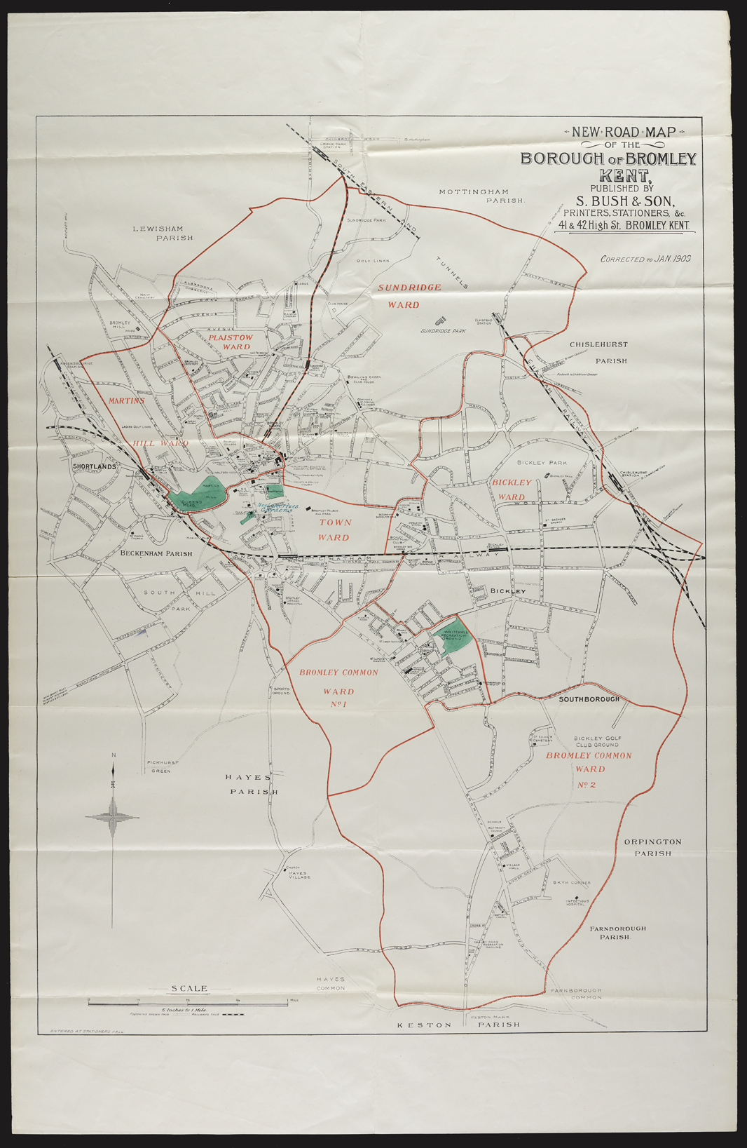
FIGURE 14. Map filed by the Borough of Bromley, 1909. National Archives HO45/10565.173.473/4.
Amenity was a particularly susceptible category: it applied to mixed environments, typically in towns, where a race to the bottom of the aesthetic scale was always an option. Where lists replaced aesthetic categories, as per the Home Office’s demand, their contents were individually fought over. Mixtures were assessed by seeking signs of commerce that would rule out aesthetics. For example, the Newark Billposting Company opposed the list of locations in Newark’s draft bylaws. It argued that a location described as “Footpaths in Beacon Hill Road” could not be a pleasure promenade having amenity because it was part of a highway leading to the “works of … Ransome & Co. employing about 700 men” and other businesses, nor could another footpath next to a farm in which “the refuse of Newark” was deposited. The council disagreed, yet it negotiated with the trade and cut down the list. Even as the Home Office approved the compromise, it was “by no means certain that the validity of this byelaw may not be challenged in a Court of Law.”Footnote 64 Judges and legislators who heard advertisers’ appeals against municipal refusals of licenses similarly searched for signs of commerce when they assessed the “amount of amenity” in specific locations. Every new hoarding became an established fact enabling the next one.Footnote 65
Ironically, in order to overcome fears of aesthetic discretion, Home Office officials themselves engaged in detailed aesthetic evaluations, based on photos submitted by local governments and advertising industry representatives. For example, in examining Evesham’s proposals for protected areas, an official agreed that a hoarding with a church in background was “no doubt” a thing worth preventing (Figure 15). However, he was “a little doubtful” if the other cases, like Figure 16, were as aesthetically valuable, since the Midland Railway station was situated there and was “an unsightly object.” Objections from a billposting company degraded the surroundings further in order to legitimize itself: what view is there to protect in this case, the company asked while filing a different photo of the same area.
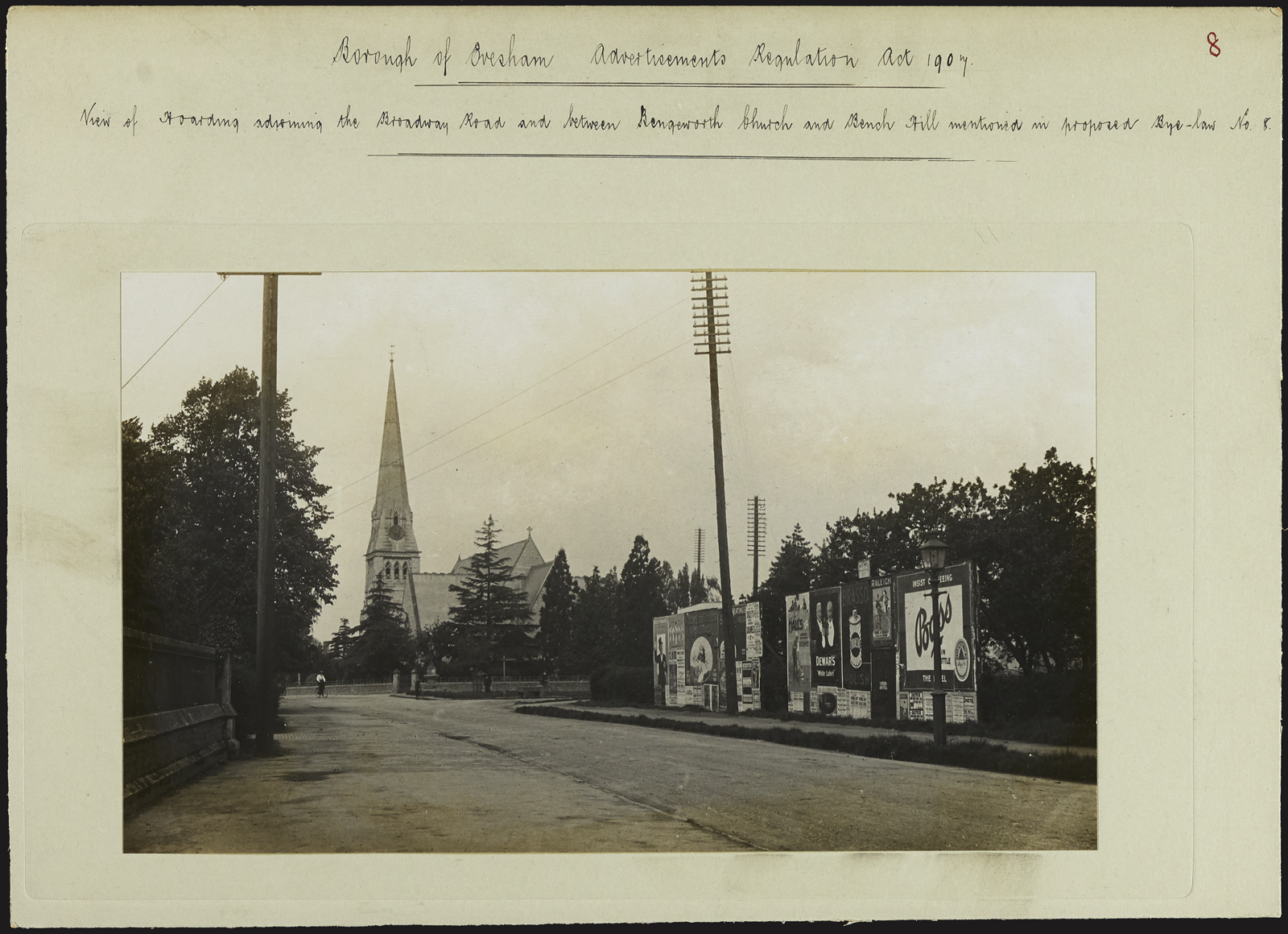
FIGURE 15. Evesham hoarding between Bengeworth Church and Bench Hill, 1913/1914. Courtesy of National Archives HO45/10697/233.030/7.
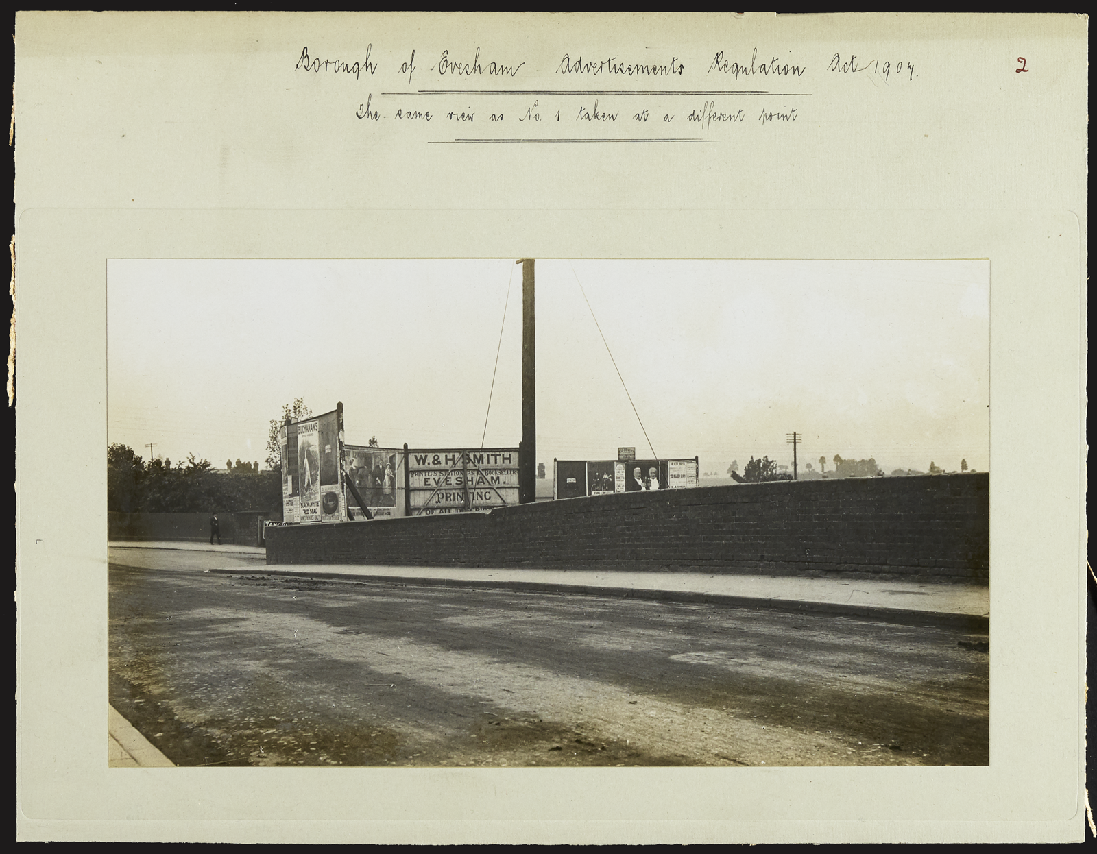
FIGURE 16. Evesham hoarding, 1913/1914. Courtesy of National Archives HO45/10697/233.030/7.
Resistance to aesthetic categories decreased with the distance from urban environments. The Home Office sanctioned abstract aesthetic concepts in bylaws of counties “with large areas of picturesque scenery,” where a list of identified spaces could be deemed unnecessary.Footnote 66 The result was that, in municipal legislation, aesthetic concepts were applied to types of municipalities (counties) more readily than to the complexities within them.
Urbanity: A Loss of Conceptual Language
The second route in the 1907 act authorized local governments to regulate and control “hoardings and similar structures used for the purpose of advertising when they exceed twelve feet in height.”Footnote 67 Hoardings up to twelve feet—that is, more than double the average adult pedestrian eye level—were exempt in the greater parts of urban landscapes—namely, those that were not landscapes of natural beauty and did not consist of public parks and pleasure promenades. This formulation drew on height limitations established previously in private bills, known as the Farnsworth model, which both the billposting trade and the parliament encouraged as default.Footnote 68 The height limitation played between safety and aesthetics; on the former, it catered to arguments that high structures were dangerous; on the latter, it treated extreme height as “unsightly” and aimed to clear skyscape views. Skies were implicitly part of the protection of natural beauty beyond the reach of commerce on the ground.Footnote 69
On its face, the height provision sounded a negative aesthetic judgment about urban environments. Even above twelve feet, the approach was less demanding for advertisers: the terminology of prevention and restriction was absent—regulation and control replaced it. Furthermore, the technical language of height stood in contrast to the conceptual language of injury to amenity and disfigurement of beauty. However, the relativity of negative judgment requires emphasis. Urbanity did not lack aesthetic values; the era saw a search for terms that would capture them. In the context of advertising, we see a duality that is worth exploring. On the one hand, there was a concession that advertising was a commercial phenomenon that corroded the highest ideals of natural beauty. Advertising therefore belonged in urban environments as aesthetically compromised locales. On the other hand, there was an elevation of hoardings over other commercial artifacts, which revealed a search for relative aesthetic merit within the commercial and, for some, an unreserved embrace of commercial aesthetics. Interpretations of legislation of this kind as strictly critical and imposed on behalf of bourgeoisie values against the masses, might miss this complexity (Valverde Reference Valverde2012). In what follows, I briefly examine the elements of reserve as well as those of celebration, which we find legislated in this clause.
To begin with aesthetic reserve, the acceptance of hoardings in urban landscapes drew on assumptions of tension between art and commerce. The place of nature at the top of the aesthetic hierarchy gave the continuum of artifacts below it a Ruskinian feel, which implied that adverts, as part of commerce, could not be good art. As we have already seen, reserve was part of the popular binarist complaint that commerce threatened beauty. It was propounded not only by critics who argued that it was “war … in which the worshippers of beauty and order … are arrayed against the worshippers of ugliness and Mammon” but also by optimists of applied art (Richmond Reference Richmond1893, 476; Morning Post 1908). In the context of advertising, binarism retained resonance despite all aesthetic investments. Two reasons for its enduring power bear noting. First, binarism was culturally useful in suppressing the market entanglements of art. As Susan Sontag (Reference Sontag and Stermer1970) commented in discussing the history of the poster, views of the artwork as intrinsically valuable were simplistic and unhistorical. Well-known artists had worked with advertisers before, while, in the nineteenth century, art was part of a viable and rapidly growing market (Presbrey Reference Presbrey1968 [1929], 29–32; Waterfield Reference Waterfield2015; Nichols et al Reference Nichols, Rebecca and Gabriel2016, introduction).Footnote 70 Projecting the realities of marketization on to advertising as a contrast to art, rescued the latter by implication.
Rescuing art by contrasting it with advertising could be self-defeating. As the advertising contractor Charles Vernon (Reference Vernon1901, 76–77) noted, critics of advertising undermined their own cause because advertisers would only consider art if they could be persuaded that it served their purposes. And, indeed, a second reason for binarism was that advertisers often accepted it. The advertising industry developed an opposition between advertising and art on two fronts. Contra aspiring regulators, it resisted encroachments on profit in the name of aesthetics. When the 1907 act was debated in parliament, objectors claimed interference with business on “sentimental grounds.”Footnote 71 Similarly, as debates about municipal bylaws reveal, the industry implicitly conceded the low aesthetic value of its own productions in its incessant search for signs of commerce to protect them. Put simply, when regulation was imminent, the industry emphasized the commercial necessity of renouncing aesthetic commitments rather than the congruities between economics and aesthetics.Footnote 72
The advertising industry also subscribed to binarism within its own practices. Many worried that art in posters could undermine commercial “effectiveness.” The Advertisers’ Review, for example, ran a regular commentary on the hoardings and reminded its readers: “The first essential in a poster is to advertise,” art came second, if it did not interfere (Advertisers’ Review 1900a, 4). As advertisers’ comments suggest, the limits of aesthetic commitment came to light when they faced the modernist formal rejection of realism. Ideas of salesmanship demanded control over interpretations of advertising messages, with a referential anchor. Of course, referential art too was open to interpretation, but the industry took a position that opposed narrative and the modern and was therefore often uncomfortable with artistic posters. Sheldon (Reference Sheldon1910, 71) summarized: “Strong individual designs of distinction and distinctiveness produced by such artists as the Beggarstaff Brothers … Aubrey Beardsley … Dudley Hardy … Julius Price … gave an immense impetus to the appetite for beauty on the hoardings. Many of these … were pretty bad as advertisements. They … did not drive the message home.”Footnote 73 Historians have argued that the uniqueness of artistic posters depended precisely on their commercial context, yet industrial actors grew wary in proportion to the emergence of a distinct genre (Sontag Reference Sontag and Stermer1970; Iskin Reference Iskin2014).Footnote 74
The logic of competition itself was contrasted with art. Competition made advertisers, on their own arguments, slaves to popular demand, not its manipulators (Billposter 1903b, 32–33). They told critics that “they are forced to neutralise the effect of their competitors’ eyesores by erecting more numerous and more incisive eyesores of their own” (Beautiful World 1903, 17). Not everyone was willing to let the industry off so easily: “[I]t was discovered that to make a placard ‘telling,’ it had far better be grotesque and horrible than a thing of beauty” (London Evening Standard 1890).Footnote 75 Something of this spirit came across in the curt language and impatient tone of a letter from an advertising agent to a sketch artist: “Will you please knock me off a couple of small sketches immediately. The point is, I want to get an advt … that will stand out, better, bolder, and more up to date in every way. … Do not take great pains with them; merely an idea is wanted.”Footnote 76 Whether as victims or propagators, advertisers saw a distance between adverts and art. These attitudes fed into public laws.
Overall, the idea that there was something aesthetically irredeemable about commerce enjoyed a wide cultural purchase. From this perspective, adverts belonged in urban surroundings, where commercial needs governed, hence the twelve foot exemption from licensing powers: “We do not agree with the National Society [SCAPA] that wall-posters in town should be regulated by aesthetic considerations. Street advertisements exist for commercial purposes among more or less commercial surroundings” (Billposter 1901b, 90). Yet to give legislative expression to the binarist opposition between advertising and art was a Pyrrhic victory. Once the appropriate environmental contexts were reified and entrenched in legislation, their future aesthetic development could only issue from the trade’s own ideas of what best served its goals, but the goals were now conceived in constitutive tension with aesthetics. Put otherwise, legislation effectively entrenched an otherwise uncertain opposition between commerce and beauty and therefore did not encourage additional aesthetic investments in advertising display and content. Instead, it perpetuated the visual culture that it was criticizing.
Urban temporality supported the same view. Adverts fitted in city streets because they were characterized by rapid pace and ephemerality, unlike art, which denoted a longue durée and required slow contemplation (Thornton Reference Thornton2009, ch. 1; see also Henkin Reference Henkin1998, 80).Footnote 77 As the history discussed so far should make clear, advertising’s ephemerality was a legal construct that supported the logic of novelty. Requirements to keep posters new and up to date were included in commercial contracts and in municipal bylaws. Ephemerality was also built into the hoarding as a structure. Thus, a London hoarding had to be removed after a judge decided that it had “a certain degree of permeance about it” and was therefore a structure within the meaning of the London Building Act 1894.Footnote 78 Impermanence was requisite. On these views, the street was for adverts but not for art; therefore, artistic improvements were necessarily short lived (Globe 1901).
These rampant forms of aesthetic reserve about advertising, however, were relative. As historians have shown in recent years, responses to urbanization were not all negative, and involved pleasure, fascination, and civic pride (for example, Layton-Jones Reference Layton-Jones2016; Readman Reference Readman2018, part 3).Footnote 79 In the case of advertising, the relativity of aesthetic degradation manifested when the hoarding was compared to other forms of advertising—a point that we will see in the next subsection—and also when it was compared to other urban artifacts. In urban environments, many people numbered hoardings among the better manifestations of commerce: “[I]n our manufacturing towns—enveloped in smoke and begrimed with dirt—the existence of colour, as represented in the modern art poster, conveys a ‘refreshing sensation’ to those who have few opportunities of viewing the varying phases of Nature herself.”Footnote 80 Posters gained in beauty contextually. As the poster artist Joseph Simpson put it, large advertisements were eyesores in the country, however good they were, “[b]ut they were all right in the town and suburbs” (Daily Graphic 1913, 6).
Some reactions revealed an absolute embrace of commercial aesthetics, not just a relative preference. This was obvious in celebrations of the industry’s private law initiatives that many viewed as an incontestable aesthetic victory. The so-called poster craze—a widespread fashion of poster collection—similarly spoke to the popular appeal of advertising aesthetics. It was something of a popular equivalent to Avant-Garde views of the lyricism of urban scenery.Footnote 81 The late nineteenth and early twentieth centuries also saw rising numbers of posters in exhibitions that celebrated their artistic value (Hewitt Reference Hewitt2007). The year 1899 marked the start of dedicated advertising exhibitions that became popular spectacles. Flocks of visitors, who as James Taylor (Reference Taylor2018) observes, likely represented a social mix, showed a taste for commercial aesthetics.Footnote 82
SCAPA idealists thought that positive aesthetic positions revealed problematic constitutions. In one imaginary discourse, a man said: “You know what a curious sense of enjoyment our race gets out of disagreeables … lots of people … do not get the pleasure that we do from nature and art: they do not, in fact, see what is fine and it follows that defacement inflicts on them no sense of loss or pain” (Beautiful World 1909, 67; emphasis in original). As Samalin (Reference Samalin2021) observes, appetites for the rotten and grotesque troubled critics of modern industrialization. Yet the strongest indication of the hoarding’s popularity was actually what SCAPA saw as mass apathy. Failures to criticize advertising were not in fact apathetic or ineffective. The hoarding’s appeal manifested in the reluctance of local and national authorities to promote legal reforms premised on aesthetics in urban centers, and in the significant scope for advertising actually created when reforms passed. In democratic moments, SCAPA too acknowledged the importance of positive views of advertising aesthetics (Beautiful World 1903, 36–37).
Overall, the twelve feet clause partook in a framing of posters and hoardings as aesthetically questionable, and, yet, as a taken-for-granted urban scene—in fact, a permanent one—comments on advertising’s ephemerality have limits to be remembered. Incentives to build hoardings for advertising were put in place with this clause, which required neither licenses nor their renewal for hoardings up to twelve feet, regardless of temporary building or safety needs. In this way, urbanity itself was legally structured. The point requires emphasis given widespread assumptions that urban advertising was a wild capture of space. Contemporaries sometimes spoke of “surrender” and of advertising’s aggressive agency (Beautiful World 1894a, 95; 1909, 26). John Taylor (Reference Taylor and Pugh1990, 190–91) indeed argues that by 1907 cities were given up as a lost cause to advertising. However, the process was far from a recapitulation before uncontrolled forces; legal shaping was part and parcel of their advance.Footnote 83 The aesthetic scale created in law assumed a meaning of urbanity that brought it into being. If, as Lynda Nead (Reference Nead2000, ch. 3) argues, advertising was a perfect match of metropolitan visual experience characterized by movement and exchange, it is necessary to see that the match was created, not found.
The Hoarding’s Competitors
When Herbert Samuel celebrated the 1907 act, he went too far in asserting that it “would not add sixpence to anyone’s wealth but was simply one for suppressing ugliness.”Footnote 84 The billposting trade achieved a competitive advantage in the process through implied aesthetic gradations of outdoor advertising. If twelve feet hoardings were contextually acceptable in urban settings, the last category on the aesthetic scale, and another layer in the hoarding’s aesthetic elevation, was advertising forms excluded by implication: the hoarding’s competitors.
The 1907 act undermined historical flyposting, on the one hand, and more recent advertising forms, on the other, which were at best subsidiary to the poster business and at worst in competition with it. As SCAPA put it, its prime goals were “sky-signs, gigantic letters, the devices in gas or electric light, which threaten to extinguish town architecture; the brutal monotony of enamel plaques; the field-boards, which deprive the people of England of much of the pleasure which landscape affords.” By comparison, SCAPA was willing to encourage “pictorial invention on paper” (Beautiful World 1896, 6–7; 1903, 31). The competitive edge was clear: “[P]oster display in suitable, or rather not violently unsuitable positions, is the most innocent form of publicity-hunting. (To many eyes and minds posters are interesting and attractive).”Footnote 85 The billposting trade could not agree more: it had long argued that alternative advertising forms were not the work of legitimate business (for example, Billposter 1900a, 71). It gradually created a list of everything it was not: “[A]dvertising enormities as the ‘Quaker Oats’ vandalism in the erection on Dover Cliffs, flashlights, sky-signs, advertising on sailing boats and bathing machines, boards in fields and disfigurement of rural scenery” (Billposter 1901b, 92).
Many forms of competition with hoardings had been incrementally curtailed over the period in more tailored forms, like the London Sky-Signs Prohibition Act of 1891,Footnote 86 restrictions on advertising vehicles from midcentury (Hackney Carriage Act 1853; see also, for example, Doncaster Corporation Act 1904, s. 91),Footnote 87 limitations on flash lights,Footnote 88 and repeat prosecutions of outdoor advertising under a variety of headings, such as defacing pavements, obstructing thoroughfares, or littering.Footnote 89 In the 1907 act, these advertising forms were depressed further through the two available routes: both the height limitation—for many were high and of “abnormal size and character” as a memorial by fifteen hundred Londoners complained about sky and flash signs (Beautiful World 1909, 32)—and the protection of beauty and amenity—the location of the hoarding’s competitors was often in landscapes designated for protection.
The 1907 act created a five-year grace period before its new restrictions came into force, which applied to “hoardings and similar structures” but not to other forms of advertisement exhibition.Footnote 90 The grace period not only implied that urban hoardings were more tolerable aesthetically than other modes of advertising, but was also constitutive: it perpetuated environments that municipalities would later find hard to designate as public parks and pleasure promenades. As we have seen, amenity was vulnerable to claims of existing use. The five-year clause recognized the long-term planning implied in the rent system that first established the hoarding’s aesthetics, and now became the basis of legislation.
CONCLUSION
This article has examined the history of the hoarding during the formative decades of mass outdoor advertising in Britain. It has traced the legal means and structures that were brought to bear on the question of advertising’s aesthetic value in a democracy concerned with beauty as part of its vision of progress. The hoarding’s history began with the creation of a new legal system of rent that transformed advertising practices and perceptions of access to public spaces, and that required an aesthetic definition to create and maintain its property status. Long before legislative reform was brought to bear on the hoarding, the advertising industry relied on private law initiatives to promote a vision of aesthetic progress, which highlighted the rational aesthetic value of poster exhibitions on hoardings and which also drew on the symbolic power of relatively few investments in artistic posters. Public law reforms accepted this vision as a basis for an aesthetic imagination of advertising within national landscapes, which implied an aesthetic hierarchy based on the relative distance of environments from commerce. At the top of the hierarchy was the beauty of nature; at its bottom, outdoor advertising forms that competed with the hoarding. The hoarding was in between.
When the bottom of the hierarchy is read upwards and then backwards in time, the process of creation comes into view. Disparate positions about the possibilities of art and beauty in advertising, which operated through disparate legal powers, ultimately cooperated to mainstream the hoarding and manage the contentious boundaries between economic and aesthetic categories. By the end of the long nineteenth century, the hoarding became a contained space manifesting borders, clear rights of use and norms of access, a logic within, and locatability within a broader conceptualization of landscape in the wake of industrialization and urbanization. It achieved a secure position between the extremes of the legally anchored aesthetic hierarchy. However, the process that entrenched the hoarding as a visual feature of outdoor life also implied a degradation. Aesthetic criticism posited art as a normative horizon for advertising, yet the process affirmed that, as a horizon, art was always receding. As Thomas Gieryn (Reference Gieryn1999, 10) succinctly explains the implications of boundary work, we learn about a field “by seeing what is far from it, or near.” A subtle legal management of cultural distance between art and advertising was at work around the hoarding, repeatedly asserted and elaborated. The reformist zeal that informed public laws cooperated with advertising interests to reify hoardings as aesthetically compromised but not lost causes, at once permissible and disparaged.
Legal developments did not end there, but the conceptual scheme established in the formative years of the hoarding continued to hold and to inform the aesthetic evaluation of advertising.Footnote 91 Its lasting power speaks to law’s role in shaping ways of seeing advertising, which created legitimacy for the visual presence of adverts, but one that came with an almost mandatory aversion.


