


Highlights
What is already known
-
• Data visualization enhances meta-analysis, aiding in identifying patterns and increasing the accessibility of evidence to end-users in science, policy, and practice.
-
• Quantitative information in meta-analyses is commonly presented through user-friendly formats, such as forest plots and funnel plots, with effect size estimates and precisions.
-
• Meta-analyses include qualitative information on study characteristics and bibliographic attributes, which are rarely visualized.
What is new
-
• Integrating the elements of scoping reviews and bibliometrics into meta-analyses enriches research synthesis by visualizing qualitative evidence.
-
• Scoping reviews (systematic mapping) can enhance meta-analyses by providing a user-friendly summary of study characteristics and identifying knowledge gaps and gluts.
-
• Bibliometric analysis can visualize nonindependent evidence, revealing dominant authors and countries, informing potential risk of bias (RoB).
-
• Further, alternative impact metrics, such as Altmetric attention scores, patents, and policy citations, can help capture the societal impacts of meta-analyses beyond academia.
Potential impact for RSM readers
-
• The proposed visualization toolkits transform qualitative information into easily digestible formats for end-users, requiring minimal additional data extraction effort from meta-analysts.
-
• The proposed visualization toolkits’ capacity can be extended to other methods in research synthesis ecosystems, such as the systematic-review family, review-of-review family, and rapid-review family, to convey quantitative information in a user-friendly manner for every evidence base.
1 Introduction
Data visualization is an effective tool for knowledge communication. It also works in meta-analysis,Reference Nikolakopoulou and Chaimani 1 – Reference Anzures-Cabrera and Higgins 3 a statistical method for quantitatively synthesizing evidence.Reference Yang, Macleod, Pan, Lagisz and Nakagawa 4 – Reference Gurevitch, Koricheva, Nakagawa and Stewart 12 The incorporation of data visualization can yield two potential benefits to meta-analysis. First, data visualization can facilitate the identification of patterns, trends, and associations, not immediately apparent within the complex meta-analytic data.Reference Kossmeier, Tran and Voracek 13 Second, it could increase the uptake and interpretation of meta-analytic findings by the end-users in science, policy, and practice.Reference Schild and Voracek 2 , Reference Tricco, Cardoso and Thomas 14 , Reference Lavis, Davies, Oxman, Denis, Golden-Biddle and Ferlie 15
Typical meta-analytic data include both quantitative and qualitative information. Quantitative information usually refers to the effect size estimates, sampling variances, and quantitative moderators. Qualitative information comes in two types: study characteristics (e.g., contextual factors of the performed research) and bibliographic attributes (e.g., author and country information). Conventionally, the meta-analytic visualization methods have primarily focused on the quantitative aspects,Reference Nikolakopoulou and Chaimani 1 , Reference Kossmeier, Tran and Voracek 13 exemplified by forest plots and funnel plots for representing effect sizes and their precisions.Reference Anzures-Cabrera and Higgins 3 However, qualitative information is rarely visualized or tends to be conveyed in a format not immediately digestible by end-users.Reference Snilstveit, Vojtkova, Bhavsar, Stevenson and Gaarder 16 Comprehensive and clear visual representation of moderator variables can facilitate customizable evidence synthesis, identifying context-specific drivers and delivering more tailored evidence for science, policy, and practice, improving the generalizability and transferability of evidence.Reference Martin, Christie and Shackelford 17 Yet, these qualitative details are no less valuable than their quantitative counterparts.
A user-friendly summary of study characteristics can add value to meta-analyses. For example, visualizing the intersections between the types of interventions and outcomes (or other combinations of two categorical variables) can identify knowledge gaps,Reference Polanin, Zhang, Taylor, Williams, Joshi and Burr 18 thus setting the agenda for future research to fill such gaps. At the same time, identifying evidence “gluts” is of urgent importance given research waste due to preventable problems,Reference Purgar, Klanjscek and Culina 19 such as designing new experiments while ignoring the existing evidence.Reference Chalmers and Glasziou 20 The need for such visualizations aligns with the tenets of scoping reviews, sometimes termed evidence review or map (see Reference Khalil and Tricco 21 , Reference Chen, Takwoingi and Grove 22 for a debate).Reference Haddaway, Bernes, Jonsson and Hedlund 23 , Reference Miake-Lye, Hempel, Shanman and Shekelle 24 Interestingly, network meta-analyses offer a precursor to integrating evidence mapping into meta-analyses. The geometry of network graphs can visually unveil the state of the evidence, distinguishing well-studied interventions from those warranting further investigation.Reference Alahdab and Murad 25
Similarly, visualizing bibliographic attributes remains relatively rare in meta-analyses. Yet, such visualizations can reveal the nonindependence of evidence.Reference Nakagawa, Samarasinghe and Haddaway 26 For example, bibliometric analyses can map author collaboration networks,Reference Aria and bibliometrix 27 define research groups, and detect hyper-dominant author clusters (see Reference Clements, Sundin, Clark and Jutfelt 28 for an example).Reference Moulin and Amaral 29 Such hyper-dominance induces nonindependent evidence and could influence between-study level risk of bias (RoB). Bibliometric analysis of traditional impact metrics (e.g., citations) can be used to map the conceptual influences within academia. Additionally, alternative impact metricsReference Trueger, Thoma, Hsu, Sullivan, Peters and Lin 30 – Reference Erdt, Nagarajan, Sin and Theng 33 have been proposed to complement traditional citation impact metrics. These alternative impact metrics, such as Altmetric attention scores, can reflect the social impact of a paper based on online news media (e.g., Facebook), policy documents, patents, Wikipedia, and Stack Overflow, reflecting the influences outside academia.
In this work, we present a series of visualization toolkits that enrich traditional meta-analyses by seamlessly integrating visualizations used in three research synthesis approaches: evidence mapping, bibliometrics, and alternative impact analyses (Figure 1). We explain the rationale of each “enrichment” approach and corresponding visualization toolkits. We then present a dedicated webpage with online step-by-step implementations of all these toolkits in R (https://yefeng0920.github.io/MA_Map_Bib/). For users with less R coding experience, we offer a guide on using three commercially free large language models (ChatGPT [https://openai.com/chatgpt/], Gemini [https://gemini.google.com/], and Copilot [https://copilot.microsoft.com/]) to modify the sample R script easily. Also, we use examples from diverse disciplines to illustrate the principles and procedures. The elegance of these proposed visualization toolkits lies in converting the qualitative information into readily digestible formats for end-users with minimal additional data extraction effort from meta-analysts. The visualization toolkits can also enrich other research synthesis methods in the research synthesis method ecosystem, including the systematic-review family (e.g., systematic reviews without meta-analysis), review-of-review family (e.g., overview, umbrella review), and rapid-review family (e.g., rapid review).Reference Sutton, Clowes, Preston and Booth 34 , Reference Grant and Booth 35

Figure 1 A conceptual diagram of the visualization framework illustrating the use of the proposed visualization approaches to enrich meta-analyses. These “enrichment” visualization approaches are adapted from research synthesis methods in the research synthesis method ecosystem, including systematic evidence map, bibliometrics (bibliometric analysis), and alternative impact metric analysis. Presented are selected hypothetical examples for the types of plots discussed in the main text. Panels (a) (grid-like graph), (b) (geographical map), and (c) (phylogenetic tree) are examples of plots used in systematic evidence maps. Panel (d) (co-authorship network) is an example of a plot used in bibliometrics. Panel (e) is a visual representation of the relationship between social media attention (e.g., Altmetric score) and study characteristics in a meta-analysis evidence base. For real examples, refer to Sections 3–5. A step-by-step implementation guide is available at https://yefeng0920.github.io/MA_Map_Bib/.
2 Visualization toolkits for integrating evidence maps, bibliometrics, and altmetrics into meta-analysis
The three enrichment analyses of qualitative information (details see below) can be implemented in conjunction with a broad spectrum of meta-analytic approaches used across different fields, including conventional random-effects, multilevel, multivariate, dose–response, longitudinal, network, location-scale, individual participant data (IPD), phylogenetic comparative models, and meta-meta-analysis.Reference Yang, Macleod, Pan, Lagisz and Nakagawa 4 , Reference Nakagawa, Yang, Macartney, Spake and Lagisz 11 Below, we present the details and case studies of the three enrichment approaches.
3 Evidence map in meta-analytic evidence base
3.1 Rationale
Evidence maps (scoping reviews) represent a form of research synthesis approach that systematically collates and catalogs existing evidence on a specific topic, yet is broader than a systematic review.Reference Munn, Pollock and Khalil 36 While similar approaches exist with varying terminologies, such as mapping reviews, systematic evidence maps, and evidence and gap maps,Reference Khalil and Tricco 21 – Reference Haddaway, Bernes, Jonsson and Hedlund 23 , Reference Alahdab and Murad 25 , Reference Saran and White 37 , Reference Campbell, Tricco and Munn 38 here we treat them as synonyms because they share a common core feature: mapping the state of the evidence, which makes them valuable for meta-analysis enrichment. We use the term “evidence mapping,” defining it as a process that employs various visualization methods to provide a user-friendly summary of study characteristics (qualitative evidence) within a meta-analysis (the end-product).Reference Snilstveit, Vojtkova, Bhavsar, Stevenson and Gaarder 16 , Reference Chen, Takwoingi and Grove 22 Incorporating evidence mapping into a meta-analysis offers two benefits. First, it inherits the merits of a conventional evidence map, such as identifying knowledge gaps, directing research priorities, and providing support for funding and policy decisions.Reference Snilstveit, Vojtkova, Bhavsar, Stevenson and Gaarder 16 , Reference Alahdab and Murad 25 Second, evidence mapping can inform methodological decisions (e.g., post hoc analyses) and interpretations of meta-analytic findings. Various visualization approaches exist, such as heatmap and bubble plotsReference Haddaway, Feierman and Grainger 39 and other displays used in the 3ie Evidence Gap Map (https://www.3ieimpact.org/evidence-hub/evidence-gap-maps)Reference Snilstveit, Vojtkova, Bhavsar, Stevenson and Gaarder 16 and Evidence-based Policing Matrix (https://cebcp.org/evidence-based-policing/the-matrix/),Reference Lum, Koper and Telep 40 for mapping the evidence landscape.
We recommend using grid-like graphs, where one dimension (e.g., intervention) is placed on the x-axis, and the other (e.g., outcomes) is placed on the y-axis, with statistics (e.g., the number of studies, number of effects, sample size) displayed at the intersection of the x- and y-axes.Reference Polanin, Zhang, Taylor, Williams, Joshi and Burr 18 Additional dimensions, such as study design, effect size, study quality, or RoB measures, can also be incorporated (see more on this point in the next section). We recommend using alluvial or Sankey diagrams to visualize the flow or overlaps in the composition of context-dependence drivers, summarizing their connections and co-linearity, and missing data patterns in an accessible manner. Additionally, a geographical map of study participants could reveal the representation status of historically underrepresented regions or groups, by incorporating location, gender, ethnic, or social backgrounds into visualizations. Understanding such patterns, in turn, can facilitate actions toward greater equity, diversity, and inclusion (EDI) in research. For phylogenetic meta-analytic analyses, visual representation of species information, such as species phylogenetic trees, can intuitively convey the breadth of taxa and underlying phylogenetic heterogeneity.
3.2 Case studies
We demonstrate the application of evidence mapping using three publicly available meta-analytic datasets (Data 1 to Data 3) from various disciplines.Reference Hodkinson, Bower and Grigoroglou 41 – Reference Sanders, Frago, Kehoe, Patterson and Gaston 43 Note that these applications are provided for illustrative purposes, and any scientific, clinical, or policy implications should not be drawn from them. The data and code for replicating all visualizations can be found at https://yefeng0920.github.io/MA_Map_Bib/.
Data 1: Hodkinson et al.Reference Hodkinson, Bower and Grigoroglou 41 conducted a network meta-analysis (including 68 studies and 80 effect size estimates) to assess the efficacy of different self-management interventions (multidisciplinary case management, regularly supported self-management, and minimally supported self-management) in enhancing the quality of life among asthma patients.
Data 2: Mertens et al.Reference Mertens, Herberz, Hahnel and Brosch 42 employed a multilevel meta-analytic model to synthesize evidence (including 212 studies and 447 effect size estimates) on the effectiveness of choice architecture interventions (often referred to as nudges) for behavior change across various techniques, behavioral domains, and other study characteristics (e.g., populations and locations).
Data 3: Sanders et al.Reference Sanders, Frago, Kehoe, Patterson and Gaston 43 used a Bayesian meta-analytic model to synthesize evidence (including 126 studies and 1,304 effect size estimates) regarding the impacts of artificial light at night on physiological, phenological, life history, activity patterns, and population/community-based outcomes. This meta-analysis included more than 180 species. For illustration, we used the subset that focused on physiological outcomes.
Evidence maps (scoping reviews) often use structured formats to map the evidence of a given field, such as participant, context, concept (PCC) and units, treatments, outcomes, or settings (UTOS).Reference Polanin, Zhang, Taylor, Williams, Joshi and Burr 18 , Reference Khalil and Tricco 21 For Data 1, we used grid-like graphs with the intervention variable on the x-axis and the outcome variable on the y-axis.Reference Polanin, Zhang, Taylor, Williams, Joshi and Burr 18 This aimed to identify knowledge gaps in self-management interventions. Each cell displayed two statistics: the number of studies and the number of effect sizes. We further quantified the population mean effect size estimate for each cell using a robust point and variance estimation approach.Reference Yang, Lagisz, Williams, Noble, Pan and Nakagawa 44 For Data 2, we utilized an alluvial diagram to illustrate the connections (collinearities) between moderator variables related to the hypotheses tested. Data 3 featured a phylogenetic tree to visualize the taxonomic breadth and relatedness among the species involved. Data processing and visualizations were conducted using packages ggplot2,Reference Wickham, Chang and Wickham 45 ape,Reference Paradis, Claude and Strimmer 46 ggtree,Reference Yu, Smith, Zhu, Guan and Lam 47 and metafor. Reference Viechtbauer 48
3.3 Results and discussion
Figure 2 shows the landscape of evidence on the effectiveness of the self-management interventions in Data 1. For example, panels (a) and (b) visually represent where randomized controlled trials (RCTs) are available to examine the interventions’ effectiveness, offering insights into which interventions have received more clinical attention. Panel (c) conveys critical information about both which interventions have been examined in the RCTs and their associated effectiveness. Panel (d) reveals a potential demographic bias, as most self-management interventions were trialed on adults. This information can inform funding strategies (e.g., funding missing RCTs, or in-depth investigation) and help clinicians gauge the volume and effectiveness of their interventions of interest.
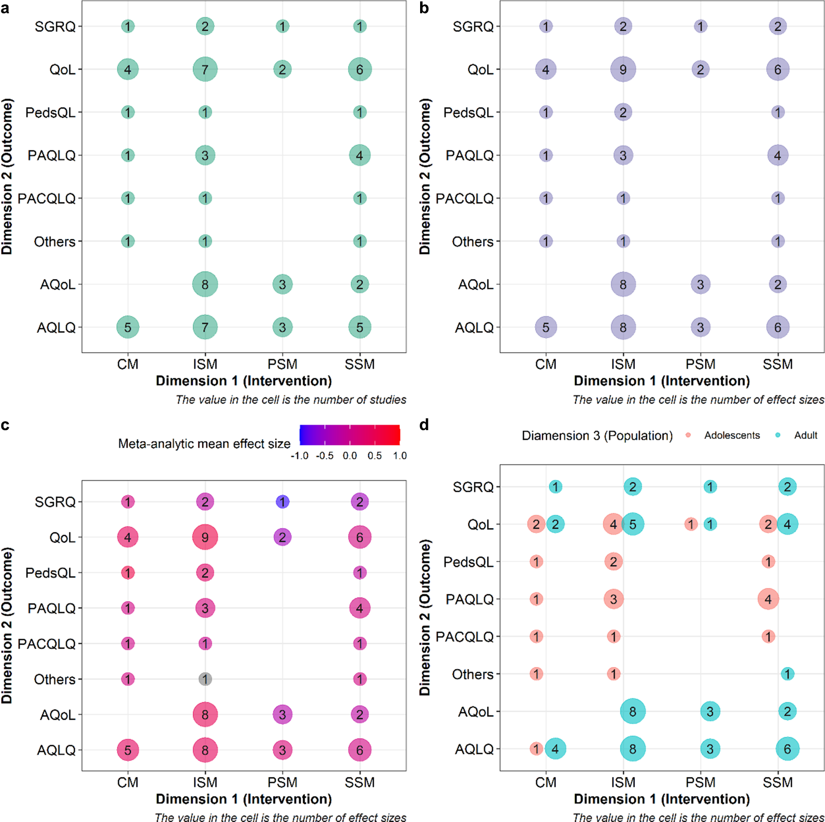
Figure 2 Examples of evidence maps visualizing study characteristics. (a) A typical grid-like graph with the intervention variable as the first dimension, the outcome variable as the second dimension, and the bubble size representing the number of studies. (b) The bubble sizes are changed to represent the number of effect sizes. (c) The color scale is applied to the bubbles to denote the magnitude of the overall mean effect size. Note that the application of Figure 2 requires that outcomes and interventions (or any other two variables reflecting study characteristics) could be categorized into different levels via moderators, as shown in Figure 2. Hedge’s g was used as the effect size measure to quantify mean differences in outcomes between an intervention and a control group. A multivariate fixed effect model was used to derive the overall average effect of each paired combination of intervention and outcome type.Reference Yang, Lagisz, Williams, Noble, Pan and Nakagawa 44 (d) The population variable is mapped to the shape serving as the third information dimension. The full names of different types of interventions are as follows: CM = case management, ISM = intensive self-management, PSM = pure self-management, SSM = support self-management. The full names of different types of outcomes are as follows: SGRQ = St Georges Respiratory Questionnaire, QoL = Quality of Life Scale, PedsQL = Pediatric Quality of Life Inventory Generic Core Scales, PAQLQ = Pediatric Asthma Quality of Life Questionnaire, PACQLQ = Pediatric Asthma Caregiver’s Quality of Life Questionnaire, AQoL = Assessment of Quality of Life, and AQLQ = Asthma Quality of Life Questionnaire. For the details of the interventions and outcomes, refer to the original paper.Reference Hodkinson, Bower and Grigoroglou 41 R code was adapted from Polanin et al.Reference Polanin, Zhang, Taylor, Williams, Joshi and Burr 18
Figure 3 highlights the diversity of experimental designs in the primary studies included, suggesting potential heterogeneity in the meta-analytic evidence in Data 2. The tested moderator variables display minimal collinearity, indicating that each variable represents a unique contextual influence. Importantly, Figure 3 provides useful visual clues to identify the contexts requested by decision-makers, facilitating the assessment of the effectiveness of interventions in the context of interest (e.g., target population and location). A follow-up customizable evidence synthesis can be conducted to improve the generalizability and transferability of meta-analytic evidence (see Reference Martin, Christie and Shackelford 17 for more details).

Figure 3 An example of an alluvial diagram showing the overlaps in the composition of moderator variables considered as potential context-dependence drivers of effect sizes in a meta-analysis.
Figure 4 presents a typical phylogenetic tree revealing the broad coverage of taxa used in artificial light at night experiments, including birds, mammals, insects, reptiles, and arachnids in Data 3. For a more in-depth statistical analysis, constructing a phylogenetic correlation matrix can quantify the effect of the shared evolutionary history among species in the meta-analytic evidence base.

Figure 4 An example of a phylogenetic tree visualizing the breadth of taxa and underlying phylogenetic heterogeneity. The effect size estimates for each species were weighted based on the inverse of the sampling variance–covariance matrix. Confidence intervals for each species were constructed using a Ward-type approach, with standard errors as the square root of the sampling variance of the weighted mean. For simplicity, we assumed a sampling correlation of 0.5 for the calculation of confidence intervals (the actual correlation should be informed from ancillary data or guesstimates by domain experts). The dot represents the average mean effect size of each species. The whisker represents the 95% confidence interval. Different colors represent different phylogenetic classes. We approximated the branch lengths of the phylogenetic tree, using the Grafen method, setting the power parameter of 1 to adjust the “height” of branch lengths at the tips of the phylogenetic tree. The correlation matrix of the phylogenetic tree was estimated, assuming that the evolution of the trait follows the Brownian motion.
4 Bibliometric map in meta-analytic evidence base
4.1 Rationale
Bibliometric analysis, often called bibliometrics, is a technique that effectively synthesizes bibliometric data to provide an overview of the performance and intellectual structure of a field.Reference Donthu, Kumar, Mukherjee, Pandey and Lim 49 It holds a unique position in the research synthesis method ecosystem because it synthesizes the bibliometric characteristics (literature metadata, not research content),Reference Nakagawa, Samarasinghe and Haddaway 26 such as authors, countries, funders, and citation counts.Reference Godin 50 Literature-level characteristics are to scientific papers as epidemiology is to patients.Reference Lewison and Devey 51 Diagnosing the “epidemiological susceptibility risk” of studies can uncover hidden biases across the evidence base. Such a process can also extend the scope of RoB assessment from within-study to between-study levels (note that between-study RoB is usually known as publication biasReference Yang, Sánchez-Tójar and O’Dea 52 while within-study RoB is just “risk of bias”). Studies are often not independent in terms of their conduct, with the same researchers potentially involved in multiple studies. Thus, highly represented authors (or research groups) may potentially dominate the production of evidence, limiting methodological diversity and generalizability. Indeed, centralized collaboration communities, which involve shared authors and employ similar protocols, have been shown to yield less replicable findings than decentralized ones, which incorporate more diverse independent research groups.Reference Danchev, Rzhetsky and Evans 53 Moreover, the publication of false, exaggerated, and falsified effects is believed to be more common in countries with a “publish or perish” culture.Reference Fanelli 54 , Reference Anderson, Ronning, De Vries and Martinson 55 For example, meta-scientific evidence suggests that studies from the United States tend to overestimate effect sizes and exhibit a larger publication bias.Reference Fanelli and Ioannidis 56 – Reference Doucouliagos, Laroche and Stanley 58
Bibliometrics can bring two major additions to meta-analyses. Bibliometrics can construct a co-authorship network for the studies included in a meta-analysis. Mapping the co-authorship network plot can intuitively reveal authorship dependence.Reference Moulin and Amaral 29 Network metrics, such as the degree of centrality, can provide quantitative insights. Bibliometrics can also identify dominant and unrepresented countries of author affiliation, or reveal interdependences between countries. Following similar principles, bibliometrics can identify research location bias (e.g., studies from high-impact or predatory journals),Reference Jannot, Agoritsas, Gayet-Ageron and Perneger 59 , Reference Barker, Pollock and Stone 60 funding source bias,Reference Barden, Derry, McQuay and Moore 61 , Reference Lynch, Cunningham, Warme, Schaad, Wolf and Leopold 62 linguistic bias,Reference Nuñez and Amano 63 , Reference Amano, Berdejo-Espinola and Akasaka 64 and time-lag bias.Reference Koricheva and Kulinskaya 65 , Reference Yang, Lagisz and Nakagawa 66 Notably, a quantitative assessment of those factors can be accomplished by conducting subgroup analysis or meta-regression.Reference Yang, Macleod, Pan, Lagisz and Nakagawa 4
4.2 Case studies
We use Data 3Reference Sanders, Frago, Kehoe, Patterson and Gaston 43 to illustrate the application of bibliometric analysis in meta-analytic evidence base. We collected bibliographic data for the primary studies included in the meta-analysis from Scopus using digital object identifier) searches. We created two bibliographic network typologies using the associated data: co-authorship and country of affiliation. The co-authorship network was constructed through collaboration analysis by multiplying two matrices, Author × Paper and Paper × Author. For the country network, bibliographic coupling was used, involving multiplication of Paper × Cited paper and Cited paper × Paper. We used bibliometrix packageReference Aria and bibliometrix 27 to construct network. Packages igraph Reference Csardi and Nepusz 67 and circlize Reference Gu, Gu, Eils, Schlesner and Brors 68 were used to project the networks.
4.3 Results and discussion
Figure 5 visually depicts the co-author network, with vertices (circles) representing authors and edges (lines) representing co-authorships in Data 3. Highly represented authors and dominant research groups can produce the majority of the evidence, reducing its methodological diversity and generalizability (certain groups might report certain results that are caused by bias in experimental designs and analyses).Reference Moulin and Amaral 29

Figure 5 An example of a co-authorship network visualizing the diversity of the research groups and the degree of centralization of the scientific community. The vertices (nodes) and edges (links) denote authors and co-authorships, respectively. Bubbles of the same color represent the same author cluster or research team. Each color denotes a co-authorship cluster (or research group). The figure was inspired by Moulin et al.,Reference Moulin and Amaral 29 who originally implemented it using Matlab and VOSviewer.
In the example meta-analytic data set, we observe nearly 90 author clusters, each of which, on average, included six authors. The largest cluster had 58 authors. To quantitatively detect the effect of hyper-dominant research groups on meta-analytic estimates, a leave-one-out analysis can be employedReference Yang, Macleod, Pan, Lagisz and Nakagawa 4 to compare the meta-analytic effect size estimates of each research group with that of the rest. Figure 6 shows the country of affiliation citation network with 34 countries of author affiliation. While there is no obvious indication of dominant countries (with country contributions shown as proportion of the circle’s perimeter), the United States, the United Kingdom, and Germany are the most prominent players in this field, and all countries appear to be linked well via article citations. At the statistical follow-up work, a multilevel meta-analytic model with random effects at the levels of author and country of affiliation clusters can be used to correct potential biases in country influence.Reference Yang, Macleod, Pan, Lagisz and Nakagawa 4 , Reference Moulin and Amaral 29

Figure 6 An example of a chord diagram showing the epistemological interdependences between different countries of author affiliation in the meta-analytic evidence base. These inter-dependences are quantified using a bibliographic coupling approach. Two countries are coupled when the cumulative bibliographies of their respective papers share one or more cited references. The coupling strength, an indicator of dominance, increases as the number of co-cited references between them increases.
5 Alternative metric analysis of meta-analytic evidence bases
5.1 Rationale
Analysis of alternative impact metrics, termed “Altmetrics,” is an approach used to estimate research impact beyond academia.Reference Erdt, Nagarajan, Sin and Theng 33 It can quantify societal impact by tracking activities on social media (e.g., Facebook and X [formerly Twitter]), Internet pages (e.g., Wikipedia), policy-related documents, and patent applications.Reference Erdt, Nagarajan, Sin and Theng 33 , Reference Bornmann, Haunschild and Adams 69 – Reference Thelwall 71 Incorporating Altmetrics into a meta-analysis can reveal the uptake of research findings by stakeholders outside academia. For example, funding agencies have explored utilizing Altmetrics to assess public engagement with the research they support.Reference Dinsmore, Allen and Dolby 72 – Reference Woolston 74 Similarly, policymakers have used it to determine early engagement with research within the policy domain.Reference McCambridge, Hawkins and Holden 75 We recommend visualizing the overall scores (e.g., Altmetric attention score), policy citations, patent citations, and overall social media attention received by studies within a meta-analysis to identify the extent to which these studies are translated into policy, practical applications, or general knowledge dissemination, respectively.
5.2 Case studies
We use one meta-analytic data to examine the replicability of the preclinical cancer biology.Reference Errington, Mathur and Soderberg 76 to illustrate the application of Altmetrics analysis, based on data from Altmetrics online service (www.altemetric.com) (Data 4). All data and code necessary for reproducing the subsequent visualizations can be accessed at the https://yefeng0920.github.io/MA_Map_Bib/. The data used for this demonstration are derived from the work of Errington et al.,Reference Errington, Mathur and Soderberg 76 who conducted a meta-analysis on the differences between the original effect size estimates and replicated effect size estimates across 50 cancer biology experiments. These experiments were sourced from 23 papers published in high-profile journals, such as Nature, Science, Cell, and PNAS.
We obtained Altmetric scores for each paper included in the meta-analytic dataset using the Altmetrics online service. This online service also provides data on the counts of policy documents and patent applications directly mentioned by organizational websites. We used API (application programming interface) to automatically retrieve the total Altmetric score, policy, and patent citation for each original publication. We visually represented the results using the orchard plotReference Nakagawa, Lagisz and O’Dea 77 and grid-like graph.Reference Polanin, Zhang, Taylor, Williams, Joshi and Burr 18
5.3 Results and discussion
Figure 7a indicates the substantial social media attention earned by cancer biology studies included in the meta-analytic evidence base. Many of these studies were mentioned in policy documents and patent applications, indicating a potential degree of practical translation. Notably, fully replicated studies exhibited relatively higher Altmetric scores, and larger policy and patent citation counts compared to that of studies that were only partially replicated and not replicated. Among the fully replicated studies, those published in PNAS, Cancer Biology, and Cell, exhibited higher impact metrics than those published in Nature and Science.

Figure 7 Examples of visualization showing the results of impact metric analysis. (a) An orchard plot with Altmetric score as the bubble and impact metric related to indicators of practical application (i.e., patent and policy citation counts) as the bubble size. (b) A grid-like graph where: 1) the color and size of the bubbles correspond to the Altmetric score, and 2) the impact metric counts, related to the indicator of practical translation (i.e., patent and policy citation counts), respectively. The grey bubble indicates that the Altmetric score exceeds 400. The categories of “full,” “partial,” and “no replication” denote that replication of studies was as fully replicated, partially replicated, or not replicated, respectively.
6 Conclusions
Meta-analysis has become a widely accepted synthesis method across various disciplines. Meanwhile, scoping reviews (evidence maps), bibliometrics, and altmetrics are gaining popularity. We leverage the visualization approaches used in these three research synthesis methods to synthesize both quantitative and qualitative evidence. For meta-analysts, the proposed toolkits require minimal effort to locate, screen, code, and appraise additional evidence, as these procedures are typically integral to a standard meta-analysis. For end-users (e.g., researchers, policymakers, and practitioners), they summarize the qualitative part of the meta-analytic evidence base in immediately digestible graphs enriched with additional dimensions. These graphs can better visualize the landscape of the meta-analytic evidence base, facilitate the identification of knowledge gaps and methodological decisions, uncover hidden biases, and map the societal impact and degree of research translation. To facilitate the adoption of the proposed visualization toolkits, we have created a dedicated website offering step-by-step implementation guides using open-source software R (https://yefeng0920.github.io/MA_Map_Bib/). Given the dynamic nature of data visualization methods and R packages, we are committed to regularly updating our website to incorporate potentially useful emerging visualization toolkits to provide a “living” arsenal for visualizing qualitative information in the meta-analytic evidence base.
Author contributions
Y.Y.: Conceptualization; data curation; formal analysis; investigation; methodology; software; visualization; writing—original draft; writing—review and editing. M.L.: Conceptualization; visualization; writing—review and editing; funding acquisition; supervision. S.N.: Conceptualization; investigation; methodology; software; validation; visualization; writing—review and editing; funding acquisition; supervision. All authors approved the final manuscript.
Competing interest statement
The authors declare that no competing interests exist.
Data availability statement
The data and analytical script to reproduce examples presented in this article are archived in GitHub repository at https://github.com/Yefeng0920/MA_Map_Bib.
Funding statement
Y.Y. was funded by the National Natural Science Foundation of China (Grant No. 32102597). S.N., Y.Y., and M.L. were funded by the Australian Research Council Discovery Grant (DP210100812 & DP230101248).


 Open access